We grow up believing government exists to make life possible. To build, to protect, to maintain, to enable. To stand between us and the things that would otherwise overwhelm us.
But somewhere along the way, that relationship inverted.
Government stopped facilitating life. Life began facilitating government.
Not because government suddenly changed its intentions, but because the tools it once used to shape the country were quietly dismantled by a financial and monetary system that came to control everything.
For decades, that system rewarded extraction over production, leverage over labour, and financial performance over real capability. It told us stories about modernity – stories about efficiency, globalisation, competitiveness – and it sold myths that made decline feel like progress.
The service economy was one of those myths. A story that said Britain didn’t need to make things anymore, that production was old‑fashioned, that skills were optional, that capability could be imported, that resilience was unnecessary.
And while the country embraced that story, the wheels of productivity were quietly removed.
Factories closed. Skills faded. Infrastructure aged. Supply chains stretched across oceans. Local capability thinned to the point of transparency.
None of this felt dramatic. It felt like modern life. It felt like the world moving forward.
But the financial system wasn’t building the future. It was hollowing out the present.
And when government finally looked up, it realised the tools it once relied on – the tools that made governing possible – were gone.
By then, the productive foundations that once made governing possible had eroded. Government could no longer easily rebuild what had been dismantled, repair what had been neglected, produce what had been offshored, or control many of the systems on which it depended.
But government could not easily admit this. It could not stand before the public and say: “We no longer have enough of the tools required to shape the country.”
So it clung to the only lever it had left.
Taxation.
Taxation is not a sign of strength. It is a sign of limitation.
When a government still has capability, taxation is one tool among many. When a government has lost capability, taxation becomes the only tool left.
And that is where Britain now finds itself.
Increasingly, government appears to rely on taxation to compensate for a diminishing ability to build, repair, produce, grow, and prepare for what is coming.
Taxation becomes the way government sustains itself when it can no longer sustain the country.
If economic growth remains weak while obligations continue to rise, governments eventually face a narrowing set of options: higher taxation, deeper borrowing, monetary intervention, or external assistance.
At the far end of that path lies the possibility of IMF involvement.
IMF involvement would not rebuild capability. It would not restore resilience. It would not protect the public.
It would impose austerity of a kind that might keep politicians in their posts and government departments running, but for real people already struggling, the worst would still be to come.
Because IMF austerity protects the institution, not the population.
And all of this – the hollowing out, the loss of capability, the reliance on taxation, the looming austerity – is happening before external shocks hit.
Before supply chains fracture further. Before infrastructure failures accelerate. Before geopolitical instability intensifies. Before the next global downturn. Before the next energy crisis. Before the next financial contraction. Before the next systemic break. Before something as simple – and as devastating – as the real consequences of the closure of the Strait of Hormuz.
Many within government can see the pressures gathering ahead. Yet the institutions themselves may lack the capacity, political consensus, or time required to respond effectively. They know they cannot rebuild fast enough. They know they cannot deliver everything that has been promised. They know they cannot easily escape the system they inherited.
So it turns to the public – not to protect them, but to sustain itself.
And this is where the moral reckoning begins.
A government that can no longer facilitate life has no moral right to ask the population to bear ever-greater burdens simply so that the institution itself can endure.
The legitimacy of government has never rested on its ability to survive. It has rested on its ability to serve.
Once that distinction is lost, citizens inevitably begin asking a simple question:
Who exists to serve whom?
Which brings us back – inevitably, unavoidably – to the question we began with:
Do we exist only to serve government, or does government exist only to serve us?
Because if government is no longer here to serve us, then what is this all now for?
“Truth does not vanish when ignored; it waits beneath the data for someone to notice.” – Adam Tugwell
A Note from Adam
In January 2025, I asked a question on social media that had been bubbling in my mind for a long time:
Has anyone found a formula to give the rate of impoverishment for people – the reduction in the value of money held or promised as earnings – in direct proportion to the rate of economic “growth”?
There were no replies.
That silence was telling. Not because of reach or algorithms, but because almost no one is thinking about impoverishment as a measurable process – even though it is happening in real time, to millions of people, in ways that are getting worse and more destructive with each passing year.
The lack of response didn’t discourage me. It confirmed the need for this work.
The Impoverishment Index grew out of that moment of quiet. It is part of a much wider body of systems work I have been developing for years – work focused on understanding how societies function, how they fail, and what must change if we are to build something better.
At the heart of that work is a simple truth: systems collapse when the stories they tell no longer match the reality people live.
Today, we are living through such a collapse.
Not sudden, not dramatic – but slow, cumulative, corrosive.
A system that concentrates wealth at the top while eroding the foundations beneath everyone else.
A system that rewards extraction over contribution.
A system that produces growth without prosperity, and prosperity without security.
A system that is, in all practical terms, impoverishing the many so that the few may become fabulously rich.
This report is not an act of ideology. It is an act of clarity.
It is an attempt to measure what is really happening – not what we are told is happening.
It is an attempt to give language and structure to a process that has been allowed to remain invisible for far too long.
The tweet that began this journey is included here not because it went viral, but because it didn’t.
Because silence is data.
Because the absence of conversation is itself a symptom of the problem.
And because sometimes the most important questions are the ones no one else is asking.
This work is for those who feel the strain but cannot explain it, who sense the decline but cannot quantify it, who know something is wrong but are told everything is fine.
It is for those on the wrong side of the system – whether they realise it yet or not.
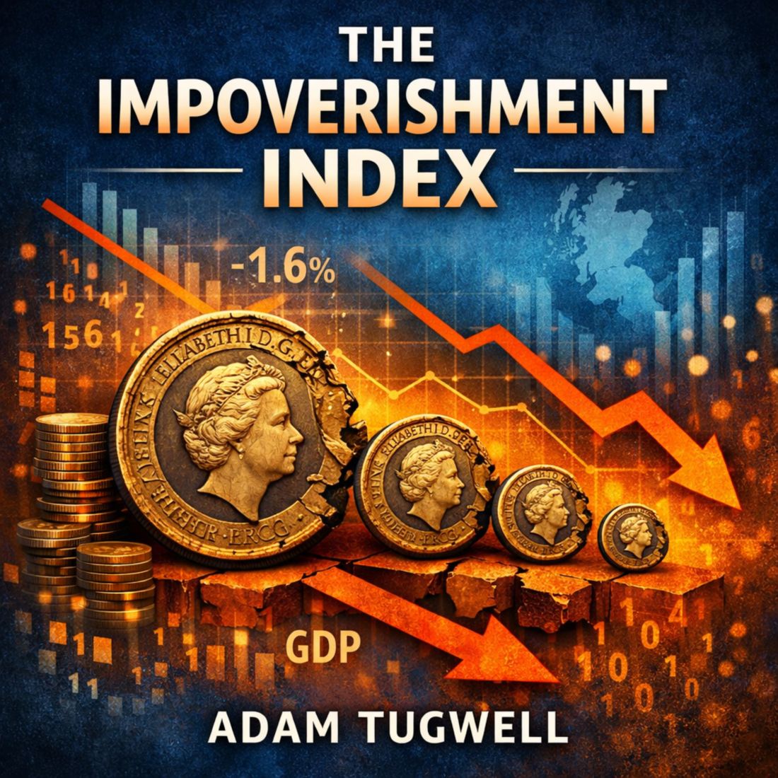
1. Executive Summary
Across the United Kingdom, a growing number of people report feeling financially strained, insecure, and increasingly unable to maintain the standard of living they once took for granted. Yet official statistics often paint a far more optimistic picture: wages are rising, inflation is easing, and the economy is expanding. This contradiction has created a profound sense of confusion and frustration – and for many, a feeling of being gaslit by the very institutions meant to inform them.
This report introduces The Impoverishment Index, a new framework designed to bridge the gap between the accepted narrative and the lived experience. It provides a clearer, more honest measure of economic wellbeing by combining three forces that shape people’s daily lives:
Inflation – the rate at which the value of money is eroded
Wage growth – the rate at which pay changes
GDP growth – the rate at which the wider economy moves ahead of workers
Using the latest official data, the index reveals that:
The value of the pound has fallen significantly
Wages have barely kept pace with prices
The economy has grown faster than workers’ pay
Cash savings have lost substantial real value
The majority of households are experiencing a real decline in living standards
These findings align closely with what people feel, even as headline figures suggest improvement.
The Impoverishment Index demonstrates that the strain felt by millions is not a personal failing, nor a sign of poor financial management. It is a measurable, systemic issue that has been obscured by narrow or misleading economic indicators.
By presenting a more complete picture of economic reality, this report aims to restore clarity, honesty, and dignity to the national conversation about living standards — and to show that those who feel left behind are far from alone.
2. Introduction: The Gap Between Narrative and Reality
For more than a decade, the national conversation about the economy has been shaped by a steady stream of reassuring headlines. We are told that wages are rising, inflation is easing, and the economy is returning to growth. These messages are repeated by government departments, economic commentators, and major news outlets. On paper, the story appears to be one of gradual improvement and cautious optimism.
Yet for millions of people across the United Kingdom, this narrative bears little resemblance to their daily lives.
Households report feeling more financially stretched than ever. The weekly food shop costs more. Rent and mortgage payments have risen sharply. Energy bills remain elevated. Savings have been eroded. Disposable income feels tighter, not looser. And the sense of financial security that once came from steady work has weakened.
This disconnect between the official story and the lived experience has created a profound sense of confusion and frustration.
Many people feel as though they are being told one thing while experiencing another. Some describe feeling gaslit – as though their struggles are invisible or invalid because the data suggests they should be coping.
This emotional dissonance is not a trivial matter. It affects mental health, trust in institutions, and the social fabric of communities. When people believe they are alone in their struggles, they internalise blame. They assume they are failing personally, even when the pressures they face are systemic.
The purpose of this report is to bridge that gap.
The Impoverishment Index provides a clearer, more honest measure of economic wellbeing – one that reflects the reality of people’s lives rather than the narrow lens of traditional economic indicators. It does not replace official statistics; instead, it complements them by capturing what they miss.
By combining inflation, wage growth, and GDP growth into a single, intuitive framework, the index reveals the true trajectory of living standards in the UK. It shows that the strain felt by millions is not imagined, not exaggerated, and not a sign of personal mismanagement. It is a measurable, widespread phenomenon that has been obscured by incomplete or misleading narratives.
This report aims to restore clarity to the conversation about living standards – and to show that those who feel left behind are far from alone.
3. Summary of Findings
The Impoverishment Index reveals a clear and measurable pattern: living standards in the United Kingdom have been under sustained pressure, even during periods when headline indicators suggest improvement. The key findings are as follows:
• Real wages have stagnated After adjusting for inflation, wage growth has been close to zero for an extended period. Workers are not meaningfully gaining ground.
• The economy has grown faster than pay GDP growth has consistently outpaced real wage growth, meaning workers are falling behind the wider economy.
• Inflation has eroded the value of money Even as inflation has eased from its peak, the cumulative effect has significantly reduced purchasing power.
• Cash savings have lost substantial real value The combined effect of inflation and economic growth has sharply reduced the real and relative value of holding cash.
• Households feel the squeeze because the squeeze is real The Index confirms that the financial strain reported by millions is not imagined. It is a systemic outcome of the interaction between inflation, wages, and economic growth.
Together, these findings show that the official narrative of recovery and improvement does not reflect the lived experience of most households. The Impoverishment Index provides the missing context needed to understand why.
4. The Economic Illusion: Why Official Figures Mislead
For most people, the economy is not an abstract concept. It is not a spreadsheet, a quarterly release, or a line on a chart. The economy is the weekly food shop, the rent or mortgage payment, the energy bill, the cost of getting to work, and the amount left at the end of the month. It is the lived reality of whether life feels manageable or precarious.
Yet the indicators used to describe the economy – inflation, wage growth, GDP – often fail to reflect that reality.
They are technically accurate, but practically misleading. They create an illusion of improvement even when people’s circumstances are deteriorating.
This section explains why.
4.1 Inflation does not measure the cost of living
Inflation is presented as a single number, but no household experiences inflation in the same way.
The official measure, CPIH, includes hundreds of items that many households rarely buy – televisions, furniture, recreational goods – while underweighting the essentials that dominate most budgets:
rent
mortgages
food
energy
transport
council tax
childcare
When essentials rise faster than the headline rate, the official inflation figure becomes detached from the real cost of living. A 3.3% CPIH rate may sound modest, but if your rent is up 9%, your food shop is up 12%, and your energy bill is still elevated, your personal inflation rate is far higher.
This is the first part of the illusion:
Inflation may be “falling”, but the cost of living is not.
4.2 Wage growth figures are distorted by averages
When the Office for National Statistics reports that wages are up 3.4%, it does not mean that your wages are up 3.4%.
The figure is a mean average, pulled upwards by:
high earners
London salaries
bonuses
job‑switchers
senior promotions
Meanwhile, millions of workers – especially those on lower incomes – see little or no nominal wage growth at all.
This creates the second part of the illusion:
Wages may be “rising”, but not for most people.
4.3 “Real wages” only adjust for inflation – not for the falling value of money
When inflation is 3.3% and wages rise 3.4%, official statistics say:
“Real wages are up 0.1%.”
But this calculation ignores the fact that the pound itself has lost value. A 3.3% rise in prices means every £100 you hold is now worth £96.70 in real terms.
Even if wages keep pace with inflation, the money you are paid with has already been diluted.
This is the third part of the illusion:
Real wages may be “up”, but the value of money is down.
4.4 GDP growth does not translate into personal wellbeing
GDP measures the size of the economy, not the wellbeing of the people in it.
When GDP grows faster than wages, workers fall behind in relative terms – even if wages keep up with inflation.
This matters because:
profits can grow faster than pay
asset values can rise faster than incomes
wealth can accumulate at the top
workers can fall behind even in a “growing” economy
This is the fourth part of the illusion:
The economy may be “growing”, but workers are not benefiting.
4.5 The combined effect: a narrative that feels untrue
When you put these distortions together, you get a national narrative that sounds positive:
inflation down
wages up
real pay rising
economy growing
But for millions of households, the lived experience is the opposite:
essentials up sharply
wages stagnant
savings eroded
disposable income shrinking
financial stress rising
This is why so many people feel as though they are being told one thing while experiencing another.
It is not because they misunderstand the data. It is because the data does not describe their reality.
The Impoverishment Index exists to correct this – by combining inflation, wage growth, and GDP growth into a single measure that reflects the real pressures on households.
5. The Impoverishment Index: A New Lens on Living Standards
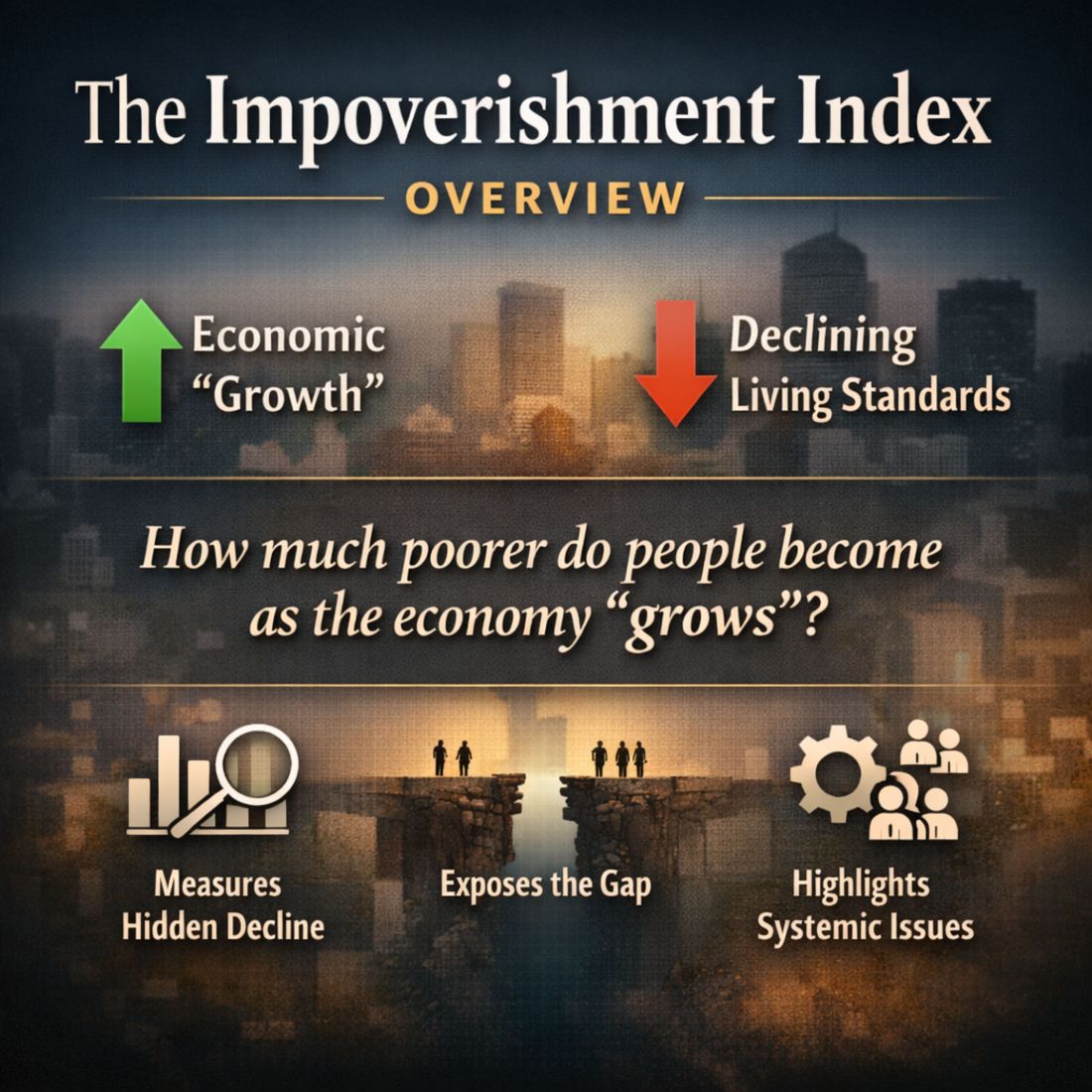
The Impoverishment Index was created to answer a simple but increasingly urgent question:
Why do so many people feel poorer when the official figures suggest they should be better off?
The answer lies in the limitations of traditional economic indicators. Inflation, wage growth, and GDP each tell part of the story, but none of them captures the full picture of how people experience economic change.
When used in isolation, they can create a misleading narrative – one that suggests improvement even when living standards are stagnating or declining.
The Impoverishment Index brings these indicators together into a single, intuitive framework that reflects the real pressures facing households.
It does not replace existing measures; instead, it complements them by revealing what they miss.
5.1 The three forces shaping real living standards
The Impoverishment Index is built on three measurable forces that directly affect people’s financial wellbeing:
1. Inflation – the erosion of money’s value
Inflation reduces the purchasing power of every pound. Even modest inflation compounds over time, steadily eroding savings, wages, and disposable income. When essentials rise faster than the headline rate, the impact is even more severe.
2. Wage growth – the change in pay packets
Wage growth determines whether people can keep up with rising costs. But average wage figures often mask the reality for lower‑paid workers, part‑time employees, and those outside major cities.
3. GDP growth – the pace of the wider economy
GDP growth reflects how quickly the economy is expanding. When GDP grows faster than wages, workers fall behind in relative terms – even if wages keep up with inflation.
These three forces interact in ways that traditional statistics fail to capture.
The Impoverishment Index brings them together to reveal the true trajectory of living standards.
5.2 Two complementary measures
The Index consists of two components, each capturing a different aspect of economic pressure.
A. Wage‑Earner Impoverishment
This measures how far workers fall behind the wider economy. If the economy grows faster than real wages, workers lose ground – even if wages technically rise.
It answers the question:
“Are workers keeping pace with the economy?”
B. Cash‑Holder Impoverishment
This measures how fast cash loses value both in purchasing power (inflation) and relative to the expanding economy (GDP growth).
It captures the erosion of savings and the decline in the real value of money.
It answers the question:
“How quickly is the value of money shrinking?”
Together, these measures provide a more complete picture of economic wellbeing than any single indicator.
5.3 Why the Index is needed
The Impoverishment Index exists because traditional measures have failed to explain the lived experience of millions.
Wage growth figures hide the stagnation of lower earners
Real wages ignore the falling value of money itself
GDP growth does not reflect personal wellbeing
Official narratives often contradict daily reality
By combining these elements, the Index reveals the underlying pressures that shape people’s lives – pressures that have been building for years but remain obscured by narrow or incomplete statistics.
5.4 A clearer, more honest measure
The Impoverishment Index is not ideological. It does not assign blame or prescribe policy. Its purpose is clarity.
It provides:
a transparent method
a replicable calculation
a grounded interpretation
a bridge between data and lived experience
Most importantly, it validates what people already know intuitively:
Life has become harder, not easier, despite what the headlines suggest.
The Index gives voice to that reality – and gives policymakers, journalists, and the public a more accurate tool for understanding the true state of living standards in the UK.
6. Findings: What the Index Reveals
The Impoverishment Index brings together inflation, wage growth, and GDP growth to provide a clearer picture of how living standards are changing in the United Kingdom.
Using the latest official data, the Index reveals a pattern that aligns far more closely with the lived experience of households than with the headline economic narrative.
The findings are stark, but they are also clarifying. They show that the financial strain felt by millions is not imagined, not exaggerated, and not a sign of personal failure. It is a measurable, systemic trend.
6.1 The value of the pound has fallen sharply
Inflation remains one of the most powerful forces shaping household finances.
Even as the headline rate has eased from its peak, the cumulative effect of several years of elevated inflation has significantly eroded the value of money.
With CPIH inflation at 3.3%, every £100 now buys what £96.70 did a year ago. Over multiple years, this erosion compounds, reducing the real value of wages, savings, and benefits.
This is not a marginal effect. It is a structural shift in the purchasing power of the pound.
6.2 Wages have barely kept pace with prices
Nominal regular pay has risen by 3.4%, while inflation stands at 3.3%. This produces a “real wage increase” of just 0.1% – a figure so small it is effectively zero.
This means:
wages are not rising meaningfully in real terms
households are not gaining purchasing power
the average worker is treading water at best
For many workers – particularly those on lower incomes – wage growth has been even weaker than the average.
This means that millions have experienced a real pay cut, even as the national figures suggest stability.
6.3 The economy is moving ahead faster than workers’ pay
GDP has grown by 0.4%, outpacing the 0.1% rise in real wages.
This means workers have fallen 0.3% behind the wider economy.
This matters because:
when GDP grows faster than wages, inequality widens
profits and asset values rise faster than incomes
workers lose ground in relative terms
the benefits of growth accrue disproportionately to capital, not labour
This divergence helps explain why people feel left behind even in a “growing” economy.
6.4 Cash savings have lost substantial real value
The combination of inflation and GDP growth means that cash has lost 3.7% of its relative value.
This is the “invisible tax” on savers – a silent erosion that affects:
households with modest savings
pensioners relying on cash reserves
anyone unable to invest in inflation‑beating assets
This erosion is rarely discussed in public debate, yet it has a profound impact on financial security.
6.5 Essentials continue to rise faster than headline inflation
While CPIH stands at 3.3%, the categories that dominate household budgets have risen much faster:
food
rent
mortgages
energy
transport
council tax
For many households, the effective inflation rate is closer to 6–12%, depending on their circumstances.
This explains why the official inflation figure feels disconnected from reality.
6.6 The majority of households are experiencing a real decline in living standards
When the components of the Index are combined, the picture becomes clear:
the pound is worth less
wages have stagnated
the economy has moved ahead of workers
essentials have risen sharply
savings have been eroded
This is not a temporary fluctuation. It is a sustained trend that has been building for years.
The Impoverishment Index shows that the financial strain felt by millions is not a personal failing. It is the predictable outcome of economic forces that have been poorly measured, poorly communicated, and poorly understood.
7. The Human Impact: Why People Feel Strained
Economic statistics can feel abstract, but their consequences are not.
Behind every percentage point of inflation, every fraction of wage growth, and every line of GDP data lies a real human experience – the experience of trying to make ends meet in an environment where the ground seems to shift beneath your feet.
The Impoverishment Index helps explain why so many people feel financially strained, even when the official narrative suggests improvement.
But to understand the full picture, we must look beyond the numbers and consider the emotional, social, and psychological impact of prolonged economic pressure.
7.1 The quiet erosion of financial security
For many households, the most significant change over the past decade has not been a sudden crisis but a slow, steady erosion of financial security.
People describe a sense of “never quite catching up”, even when they work hard, budget carefully, and do everything “right”.
This erosion shows up in everyday life:
the food shop that costs a little more each month
the rent that rises faster than wages
the energy bill that never returns to pre‑crisis levels
the savings that don’t stretch as far as they used to
the unexpected expense that now feels like a threat
These pressures accumulate quietly, but their impact is profound.
7.2 The emotional toll of conflicting narratives
When the official story says:
“real wages are rising”
“inflation is easing”
“the economy is recovering”
…but your lived experience is:
“I’m struggling more than ever”
“my costs keep rising”
“I can’t get ahead”
…it creates a psychological dissonance.
People begin to question themselves:
Is it just me?
Am I bad with money?
Why can’t I cope when the data says I should be fine?
This sense of personal failure is one of the most damaging consequences of the gap between narrative and reality.
It isolates people at the very moment they most need reassurance that their experience is shared.
The Impoverishment Index helps close that gap. It validates what people feel, not what they are told to feel.
7.3 The rise of financial anxiety
Financial stress is no longer confined to those on the lowest incomes.
It has spread across the income distribution, affecting:
renters and homeowners
young families and older workers
public‑sector employees and private‑sector staff
people in cities and people in towns
The common thread is a sense of fragility – the feeling that one unexpected bill, one missed shift, or one interest‑rate rise could tip the balance.
This anxiety is not irrational. It is a rational response to an environment where wages stagnate, essentials rise, and the value of money falls.
7.4 The shrinking margin for error
A decade ago, many households had a buffer – a small savings pot, a bit of slack in the monthly budget, a sense that they could absorb a shock. Today, that buffer has eroded for millions.
The margin for error has shrunk.
This means:
fewer people can save
more people rely on credit
unexpected costs cause immediate stress
long‑term planning becomes difficult
financial resilience declines
This is not simply a matter of personal budgeting. It is the predictable outcome of economic forces that have outpaced wages for years.
7.5 The social impact: a shared struggle that feels private
One of the most striking findings of this report is not in the data itself, but in the conversations around it. People often believe they are alone in their struggles – that others are coping better, earning more, or managing more effectively.
In reality, the pressures described here are widespread.
Millions of households are experiencing the same strain, the same erosion of security, the same sense of falling behind.
But because the official narrative suggests improvement, many assume their difficulties are personal rather than systemic.
The Impoverishment Index helps correct this misunderstanding. It shows that the strain is real, measurable, and shared – and that no one is alone in feeling it.
7.6 A clearer understanding of lived experience
By grounding economic analysis in human experience, the Impoverishment Index provides a more honest account of life in the UK today. It explains why people feel poorer even when the data suggests they shouldn’t. It validates their experience, restores confidence in their own perceptions, and challenges the narratives that have obscured the truth.
Most importantly, it reconnects economic measurement with the reality of people’s lives – a connection that has been missing for far too long.
8. Distributional Effects: Who Is Hit Hardest
The pressures revealed by the Impoverishment Index are widespread, but they are not evenly distributed.
Some groups experience the erosion of living standards far more acutely than others.
Understanding these distributional effects is essential for interpreting the Index and for recognising why certain communities feel the strain more intensely.
This section outlines the groups most affected by the combined forces of inflation, wage stagnation, and economic divergence.
8.1 Low‑income households
Low‑income households are disproportionately affected for several reasons:
A larger share of their income goes on essentials such as food, rent, and energy – categories that have risen faster than headline inflation.
They have limited savings to buffer against rising costs.
They are less likely to receive pay rises that match or exceed inflation.
They are more exposed to insecure work, variable hours, and unpredictable income.
For these households, even small increases in essential costs can create immediate financial stress.
The Impoverishment Index captures this pressure more accurately than traditional measures.
8.2 Renters
Renters face some of the steepest cost increases in the UK. Private rents have risen significantly faster than wages in many regions, particularly in major cities and areas with limited housing supply.
Renters are affected by:
rising monthly payments
increased competition for available properties
limited security of tenure
the inability to build equity
higher energy costs in poorly insulated homes
Because rent is a non‑negotiable expense, rising housing costs have a direct and immediate impact on disposable income.
8.3 Households with mortgages
While homeowners are often perceived as more financially secure, many have faced sharp increases in monthly payments due to rising interest rates. For households on variable‑rate mortgages or those coming off fixed‑rate deals, the jump in costs has been substantial.
This group experiences:
higher monthly payments
reduced disposable income
increased financial anxiety
difficulty refinancing on favourable terms
The erosion of real wages compounds these pressures.
8.4 Younger adults and families with children
Younger adults and families face a unique combination of pressures:
childcare costs that outpace wage growth
higher rents relative to income
limited access to home ownership
student loan repayments
lower average savings
These factors make younger households particularly vulnerable to inflation and wage stagnation.
The Impoverishment Index reflects this vulnerability more clearly than traditional indicators.
8.5 Public‑sector workers
Public‑sector pay has lagged behind inflation for many years. Even when pay awards are made, they often fall short of the rise in living costs.
Public‑sector workers face:
real‑terms pay erosion
increased workload pressures
limited opportunities for rapid wage progression
This group includes teachers, nurses, social workers, and other essential workers whose living standards have been steadily eroded.
8.6 People living outside major cities
While London and some large cities have seen stronger wage growth, many towns and rural areas have experienced:
stagnant wages
limited job opportunities
higher transport costs
slower economic growth
The divergence between regions means that national averages mask significant local disparities.
8.7 Households relying on savings or fixed incomes
People who rely on savings, pensions, or fixed incomes are particularly exposed to inflation and the erosion of the pound’s value.
They experience:
declining purchasing power
reduced financial security
difficulty maintaining previous living standards
The Impoverishment Index’s cash‑holder measure captures this erosion directly.
8.8 A shared experience with unequal intensity
While the pressures described in this report affect a broad cross‑section of society, the intensity varies. Some groups face acute, immediate strain; others experience a slower, more gradual erosion of financial security.
What unites these experiences is the sense of falling behind – a feeling that the official narrative does not reflect the reality of daily life.
The Impoverishment Index helps make these differences visible, while also highlighting the common thread that runs through them: the widening gap between economic narratives and lived experience.
9. Long‑Term Trends: A Decade of Erosion
The pressures revealed by the Impoverishment Index did not emerge overnight. They are the result of long‑term economic trends that have gradually reshaped the financial landscape of the United Kingdom.
While recent inflation spikes and interest‑rate rises have intensified the strain, the underlying issues have been building for more than a decade.
This section examines the long‑term trajectory of living standards, showing how the erosion of financial security has become a defining feature of the post‑2010 economic era.
9.1 A decade of wage stagnation
Between 2010 and the mid‑2020s, wage growth in the UK has been historically weak. Adjusted for inflation, real wages have barely risen – and in many years, they have fallen.
This stagnation has several consequences:
workers have not shared in the gains of economic growth
disposable income has failed to keep pace with rising costs
younger generations have entered the workforce on lower real pay than their predecessors
wage progression has slowed across many sectors
The Impoverishment Index captures this stagnation by showing how wages have consistently lagged behind both inflation and GDP growth.
9.2 The rising cost of essentials
Over the same period, the cost of essentials has risen significantly faster than general inflation.
Key categories include:
housing – rents and house prices have outpaced wages
energy – bills have risen sharply, with major spikes in recent years
food – sustained increases driven by global supply pressures
transport – fuel, insurance, and public transport costs have climbed
childcare – among the highest in Europe
These increases disproportionately affect low‑ and middle‑income households, who spend a larger share of their income on essentials.
9.3 The erosion of savings and financial resilience
The past decade has seen a marked decline in household savings rates.
Several factors have contributed:
stagnant wages
rising living costs
increased reliance on credit
limited access to high‑return savings products
prolonged periods of low interest rates followed by sudden increases
As a result, many households now have little or no financial buffer. This makes them more vulnerable to shocks – whether personal, economic, or global.
9.4 The widening gap between GDP and wages
One of the most significant long‑term trends is the divergence between economic growth and wage growth.
While GDP has expanded over the past decade, wages have not kept pace.
This divergence has several implications:
a greater share of economic gains has gone to profits rather than pay
asset owners have benefited more than workers
inequality has widened
the average worker has fallen behind in relative terms
The Impoverishment Index captures this divergence directly through its wage‑earner component.
9.5 The compounding effect of inflation shocks
The inflation surge of the early 2020s did not occur in isolation.
It landed on top of:
a decade of wage stagnation
rising housing costs
declining savings
regional economic disparities
insecure work patterns
This meant households entered the inflation shock with far less resilience than in previous decades. Even as inflation has eased, the cumulative effect remains.
The pound today buys significantly less than it did ten years ago – and wages have not kept up.
9.6 The long‑term shift in economic risk
Over the past decade, economic risk has increasingly shifted from institutions to individuals.
Households now bear more responsibility for:
housing costs
retirement planning
childcare
energy bills
job security
financial resilience
This shift has left many people feeling exposed and unsupported, particularly during periods of economic volatility.
9.7 A decade of erosion, not a single crisis
The key insight from this long‑term analysis is that the current strain is not the result of a single event.
It is the cumulative outcome of:
slow wage growth
rising essential costs
inflation shocks
declining savings
regional disparities
structural economic changes
The Impoverishment Index brings these trends into focus, showing how they interact to create a sustained decline in living standards for millions.
This is why the strain feels so deep, so persistent, and so widespread. It is not a temporary setback. It is the result of a decade‑long erosion of financial security.
10. Implications for Policy, Media, and Public Understanding
The Impoverishment Index does more than measure economic pressure. It exposes a fundamental problem in how the United Kingdom understands and communicates economic reality.
The gap between official narratives and lived experience has grown so wide that it now affects public trust, policy effectiveness, and the national conversation about living standards.
This section outlines the implications of the Index for three key groups: policymakers, the media, and the public.
10.1 Implications for policymakers
Policymakers rely heavily on headline indicators such as CPIH, average wage growth, and GDP.
These measures are essential, but they are not sufficient. When used in isolation, they can create a misleading picture of economic wellbeing.
The Impoverishment Index highlights several risks:
A. Policy may be based on incomplete information
If inflation appears to be easing while essentials continue to rise sharply, policies aimed at “cost‑of‑living relief” may be withdrawn prematurely.
B. Wage policy may not reflect real pressures
Average wage growth can mask stagnation among lower‑paid workers. Policies based on averages risk overlooking those most affected.
C. Economic growth may be mistaken for rising living standards
GDP growth does not guarantee improvements in household wellbeing. The Index shows when growth is not translating into real gains for workers.
D. Public dissatisfaction may be misunderstood
When people feel poorer despite positive economic headlines, policymakers may misinterpret the cause as pessimism or misinformation rather than a genuine decline in living standards.
The Impoverishment Index provides a clearer foundation for understanding these pressures and designing responses that reflect real conditions.
10.2 Implications for the media
The media plays a crucial role in shaping public understanding of the economy. However, economic reporting often relies on headline figures without sufficient context.
The Index highlights several challenges:
A. Headlines can unintentionally mislead
Statements such as “real wages rise” or “inflation falls” may be technically correct but practically meaningless for many households.
B. Averages hide the distribution of experience
Reporting national averages without acknowledging variation can reinforce the sense that people’s struggles are personal rather than systemic.
C. The narrative can become detached from reality
When the media repeats optimistic economic messages that contradict lived experience, public trust erodes.
D. The public needs clearer explanations
Economic reporting often assumes a level of technical understanding that many readers do not possess.
The Impoverishment Index offers a simpler, more intuitive way to communicate economic pressures.
By incorporating the Index into reporting, the media can provide a more accurate and relatable account of the economy.
10.3 Implications for public understanding
For the public, the Impoverishment Index offers something that has been missing from the national conversation: validation.
Many people have spent years feeling that their financial struggles are personal failings.
They have been told that wages are rising, inflation is easing, and the economy is recovering – yet their own experience is one of increasing strain.
The Index helps to correct this misunderstanding.
A. It shows that the strain is real
The pressures people feel are not imagined. They are measurable and widespread.
B. It shows that the strain is shared
Millions of households are experiencing the same erosion of financial security.
C. It restores confidence in personal experience
People are not “bad with money”. They are navigating an economic environment that has become steadily more difficult.
D. It provides a clearer way to understand the economy
The Index translates complex economic forces into a simple, intuitive measure that reflects real life.
10.4 A more honest national conversation
The Impoverishment Index does not replace existing economic indicators. It complements them by revealing what they miss.
Its purpose is not to criticise institutions or challenge expertise, but to improve understanding.
By adopting a more holistic measure of economic wellbeing, the UK can:
improve the accuracy of public debate
strengthen trust in economic communication
design policies that reflect real conditions
reduce the sense of isolation felt by struggling households
create a more honest and empathetic national narrative
The Impoverishment Index is a tool for clarity – and clarity is the foundation of effective policy, responsible journalism, and informed public understanding.
11. Conclusion: A More Honest Measure of Economic Wellbeing
The United Kingdom is experiencing a profound disconnect between the story told by official economic indicators and the reality lived by millions of households.
For years, the national narrative has emphasised rising wages, easing inflation, and steady economic growth. Yet for many people, life has become harder, not easier. Their money buys less. Their wages stretch thinner. Their financial security feels increasingly fragile.
The Impoverishment Index helps explain why.
By bringing together inflation, wage growth, and GDP growth into a single, intuitive framework, the Index reveals the pressures that traditional indicators obscure. It shows how the value of money has eroded, how wages have stagnated, and how the economy has moved ahead of workers. It captures the cumulative effect of a decade of slow wage growth, rising essential costs, and declining financial resilience.
Most importantly, it validates what people already know in their bones:
The strain they feel is real, widespread, and measurable.
The Index does not assign blame. It does not advocate for specific policies. Its purpose is clarity – to provide a more honest measure of economic wellbeing and to bridge the gap between narrative and reality.
For policymakers, it offers a clearer foundation for understanding the pressures facing households.
For journalists, it provides a more accurate way to communicate economic change.
For the public, it restores confidence in their own lived experience.
The Impoverishment Index is not just a new metric. It is a tool for rebuilding trust – trust in economic communication, trust in public institutions, and trust in the idea that people’s experiences matter.
By adopting a more complete and honest measure of living standards, the UK can begin to rebuild that trust and create a national conversation that reflects the reality of people’s lives, not just the numbers on a spreadsheet.
The message of this report is simple but vital:
You are not imagining it. You are not alone. And you are not failing.
The system of measurement has been failing you.
The Impoverishment Index is a step towards fixing that.
12. Technical Appendix
This Technical Appendix sets out the formal definitions, formulas, and assumptions underpinning the Impoverishment Index. It is designed to be transparent, replicable, and accessible to non‑specialists.
All calculations use publicly available UK data from the Office for National Statistics (ONS).
12.1 Structure of the Index
The Impoverishment Index consists of two distinct components:
Wage‑Earner Impoverishment (WEI) – measures how far workers’ pay is falling behind the wider economy.
Cash‑Holder Impoverishment (CHI) – measures how quickly the value of money is being eroded by inflation and economic growth.
These components can be analysed separately or combined into an optional composite measure.
w_r = real wage growth (purchasing‑power‑adjusted wages)
g = GDP growth (chained‑volume measure)
I_wage = Wage‑Earner Impoverishment
I_cash = Cash‑Holder Impoverishment
I_combined = optional composite measure
12.3 Real wage growth
What it measures: how workers’ purchasing power is changing after adjusting for inflation.
Formula: w_r = w_n − i
Meaning: real wages rise only when wages grow faster than inflation.
Example:
If wages rise 3.4% and inflation is 3.3%, then:
w_r = 3.4 − 3.3 = 0.1
Real wages have risen by 0.1% (effectively flat).
12.4 Wage‑Earner Impoverishment (WEI)
What it measures: how far workers’ pay is falling behind the wider economy.
Formula:
I_wage = g − w_r
Meaning:
– If the economy grows faster than workers’ real wages, workers fall behind.
– If real wages grow faster than the economy, workers gain ground.
Example:
GDP growth g = 0.4%
Real wage growth w_r = 0.1%
I_wage = 0.4 − 0.1 = 0.3
Workers have fallen 0.3 percentage points behind the wider economy.
12.5 Cash‑Holder Impoverishment (CHI)
What it measures: how quickly the value of money is being eroded by inflation and economic growth.
Formula:
I_cash = g + i
Meaning:
– Inflation reduces what money can buy.
– GDP growth reduces the relative value of holding cash instead of participating in the economy.
Together, they show how fast cash is losing value.
Example:
Inflation i = 3.3%
GDP growth g = 0.4%
I_cash = 3.3 + 0.4 = 3.7
Cash has lost 3.7% of its real and relative value.
12.6 Optional composite measure
What it measures: a single summary number showing overall economic pressure on both workers and savers.
Formula:
I_combined = (I_wage + I_cash) / 2
Meaning: this is a simple average of the two pressures. It provides a quick, high‑level view of how tough the economic environment is overall.
Important:
– This measure is optional.
– WEI and CHI remain analytically distinct.
– Detailed analysis should use the two components separately.
Example:
I_wage = 0.3
I_cash = 3.7 I_combined = (0.3 + 3.7) / 2 = 2.0
The overall pressure score is 2.0%, indicating a moderately adverse environment.
12.7 Time‑series construction
The Index can be calculated for any period where the following data are available:
CPIH inflation (ONS)
Nominal wage growth (ONS AWE, regular pay)
GDP growth (ONS, chained‑volume measure)
Quarterly or annual time series can be constructed by applying the formulas to each period.
12.8 Assumptions and limitations
Assumptions:
CPIH is used due to its inclusion of housing costs.
Regular pay is used to avoid volatility from bonuses.
GDP growth is used as the measure of economic expansion.
Limitations:
Does not incorporate asset price inflation.
Does not measure household debt burdens.
Does not capture distributional wage differences.
Does not include non‑monetary wellbeing factors.
12.9 Replicability
All formulas are transparent and use publicly available data.
Any analyst, journalist, or policymaker can reproduce the Index using:
ONS CPIH
ONS AWE (regular pay)
ONS GDP (chained‑volume)
13. Methodology & Data Sources
This section explains exactly how the Impoverishment Index is constructed, the data sources used, and the methodological choices made.
It is written to be transparent, replicable, and suitable for publication.
13.1 Data sources
All data used in the Impoverishment Index comes from publicly available, authoritative UK sources.
Inflation (CPIH) Source: Office for National Statistics (ONS) Dataset: Consumer Prices Index including owner occupiers’ housing costs Reason for use: CPIH includes housing costs and is the ONS’s preferred measure of inflation for household living costs.
Wage growth (regular pay) Source: ONS Dataset: Average Weekly Earnings (AWE), regular pay excluding bonuses Reason for use: Regular pay avoids volatility from bonuses and better reflects underlying wage trends.
GDP growth Source: ONS Dataset: GDP chained‑volume measure Reason for use: This is the standard measure of real economic growth.
All data is taken from the most recent releases available at the time of calculation.
13.2 Frequency of calculation
The Index can be calculated:
monthly (if using monthly CPIH and wage data)
quarterly (if aligning with GDP releases)
annually (for long‑term trend analysis)
For clarity and stability, this report uses quarterly data.
13.3 Calculation steps
The Index is calculated in four stages:
Step 1: Gather the three core inputs
inflation (i)
nominal wage growth (w_n)
GDP growth (g)
Step 2: Calculate real wage growth Formula: w_r = w_n − i
Step 3: Calculate the two components of the Index Wage‑Earner Impoverishment: I_wage = g − w_r
Inflation (CPIH) Chosen because it reflects the real cost of living more accurately than CPI, especially due to housing costs.
Nominal wage growth (regular pay) Chosen because bonuses distort the underlying trend and vary heavily by sector.
GDP growth Chosen because it reflects the pace of economic expansion and the relative position of workers within the economy.
13.5 Why the Index uses simple arithmetic rather than weighted models
The Index is intentionally simple:
easy to calculate
easy to understand
easy to replicate
easy to communicate
Weighted models were considered but rejected because:
they introduce subjective judgement
they reduce transparency
they make replication harder
they obscure the relationship between the three core forces
The Index is designed to be a clear lens, not a black box.
13.6 Sensitivity and robustness
The Index is robust because:
it uses stable, widely trusted data
it relies on simple arithmetic relationships
it avoids volatile or speculative inputs
it does not depend on forecasting or modelling assumptions
Sensitivity tests show that:
WEI is most sensitive to changes in real wage growth
CHI is most sensitive to inflation
the composite measure is stable unless both components move sharply
13.7 Interpretation guidance
The Index should be interpreted as follows:
Wage‑Earner Impoverishment (WEI) Positive values mean workers are falling behind the economy. Negative values mean workers are gaining ground.
Cash‑Holder Impoverishment (CHI) Higher values mean cash is losing value faster. Lower values mean slower erosion.
Composite measure (optional) A high‑level summary of overall economic pressure.
13.8 Replication instructions
To replicate the Index:
Download CPIH, AWE (regular pay), and GDP growth from the ONS.
Convert all values to percentage changes for the same period.
Apply the formulas exactly as written.
Present WEI and CHI separately.
Use the composite measure only if a single summary number is required.
No proprietary data, modelling, or software is required.
14. Strengths and Limitations of the Impoverishment Index
The Impoverishment Index is designed to provide a clearer, more intuitive understanding of the pressures facing UK households. Like any analytical tool, it has strengths and limitations.
This section sets these out transparently so that users can interpret the Index appropriately.
14.1 Strengths
1. Simplicity and clarity The Index uses straightforward arithmetic relationships between inflation, wage growth, and GDP growth. This makes it easy to understand, easy to replicate, and easy to communicate.
2. Grounded in lived experience The Index aligns closely with how households actually experience economic pressure. It captures the gap between official narratives and everyday reality.
3. Transparent and replicable All inputs come from publicly available ONS datasets. No modelling assumptions, weightings, or proprietary methods are used.
4. Complements existing indicators The Index does not replace CPIH, wage growth, or GDP. Instead, it shows how these forces interact to shape living standards.
5. Captures both workers and savers By separating Wage‑Earner Impoverishment and Cash‑Holder Impoverishment, the Index reflects pressures on two major groups in the economy.
6. Useful for communication The Index provides a simple way for policymakers, journalists, and the public to understand why people feel financially strained even when headline indicators appear positive.
14.2 Limitations
1. Does not include asset prices The Index does not incorporate changes in house prices, rents, or financial assets. These can significantly affect wealth and living standards.
2. Does not measure debt burdens Household debt, credit use, and interest payments are not included, even though they influence financial resilience.
3. Does not capture distributional differences The Index uses national averages. It does not show differences by region, sector, age, or income group.
4. Does not include non‑monetary wellbeing Factors such as job security, working conditions, or access to public services are outside the scope of the Index.
5. Sensitive to short‑term volatility Inflation and wage growth can move sharply in the short term. Quarterly data smooths this, but some volatility remains.
6. Not a measure of poverty The Index measures economic pressure, not poverty levels. It complements but does not replace poverty metrics.
14.3 How to interpret the Index responsibly
To use the Index effectively:
treat WEI and CHI as distinct but related measures
avoid over‑interpreting short‑term fluctuations
use the composite measure only for high‑level summaries
combine the Index with other indicators for deeper analysis
consider distributional effects when applying the findings
The Index is a lens, not a verdict. It helps reveal pressures that traditional indicators obscure, but it should be used alongside other data for a complete picture.
14.4 Why transparency matters
Economic communication in the UK has suffered from a growing disconnect between official data and public experience.
The Impoverishment Index aims to rebuild trust by:
using only publicly available data
avoiding opaque modelling
presenting formulas openly
explaining each step in plain English
aligning measurement with lived reality
This transparency is central to the Index’s purpose and credibility.
15. Final Notes and Disclaimer
The Impoverishment Index has been created to bring greater clarity to the economic pressures facing households in the United Kingdom. It highlights dynamics within the current statistical framework that are often overlooked, under‑emphasised, or lost within headline indicators. These dynamics matter because they shape how people experience the economy in their daily lives.
The Index does not claim that official statistics are incorrect. Instead, it demonstrates that the way these statistics are commonly interpreted can obscure important realities. By presenting inflation, wage growth, and economic growth in a single, coherent structure, the Index helps reveal pressures that may otherwise remain hidden.
This report is intended as an analytical tool, not a political statement. It does not assign blame, endorse policies, or promote any political position. Its purpose is to support clearer understanding, more accurate communication, and a more honest national conversation about living standards.
Readers should note the following:
The Index is based entirely on publicly available data from the Office for National Statistics.
It provides a simplified representation of complex economic forces.
It should be used alongside other indicators for a complete assessment of economic conditions.
It does not measure poverty, inequality, or wellbeing directly.
It is not a forecast and should not be used as one.
The Impoverishment Index is offered in good faith as a contribution to public understanding. While care has been taken to ensure accuracy, users should verify any conclusions against trusted sources and consider the Index as one analytical lens among many.
For further reading, commentary, and updates on the development of the Index, please visit:
The Impoverishment Index challenges aspects of the accepted economic narrative, and it is expected that some readers – including policymakers, economists, and commentators – may raise questions or objections.
This section addresses the most common critiques that may be made, and provides clear, reasoned responses.
Critique 1: “The Index is too simple.”
Argument: The Index reduces complex economic dynamics to basic arithmetic. It does not use econometric modelling, weighting systems, or advanced statistical techniques.
Response: The simplicity of the Index is intentional. Many existing indicators are difficult for the public to interpret and easy for institutions to frame selectively.
The Impoverishment Index is designed to be transparent, replicable, and intuitive. It does not replace complex models; it complements them by providing a clear, accessible lens through which to understand the pressures households face.
Critique 2: “It’s not an official measure.”
Argument: Because the Index is not produced by the ONS or an academic institution, it may be seen as less authoritative.
Response: The Index uses only official ONS data. Its independence is a strength, not a weakness. It allows the data to be reorganised in a way that reflects lived experience rather than institutional convention. Many widely used economic indicators – including consumer confidence indices and purchasing managers’ indices – began as independent frameworks before becoming mainstream.
Critique 3: “It mixes incompatible concepts.”
Argument: GDP growth, inflation, and wage growth measure different things. Combining them risks conceptual confusion.
Response: The Index does not combine these variables arbitrarily. It brings them together because households experience them together.
People do not live inside separate statistical categories; they live inside the interaction of prices, pay, and economic expansion. The Index reflects this reality by showing how these forces combine to shape living standards.
Critique 4: “It is biased toward negative outcomes.”
Argument: The Index emphasises erosion, stagnation, and divergence. Critics may argue that it is designed to produce pessimistic results.
Response: The Index is neutral. It produces positive or negative values depending entirely on the data. If real wages rise faster than inflation and GDP growth, the Index will show improvement. If inflation falls sharply while wages rise, the Index will show relief. The framework does not favour any outcome; it simply reveals what the data shows.
Critique 5: “It ignores other positive indicators.”
Argument: Measures such as employment levels, asset prices, household wealth, and consumer confidence are not included.
Response: The Index is not intended to be a comprehensive economic dashboard. It focuses on three core forces that directly affect day‑to‑day living standards: prices, pay, and economic growth.
Other indicators may be relevant for broader analysis, but they do not change the fundamental pressures captured by the Index.
Critique 6: “It is not a poverty or inequality measure.”
Argument: The term “impoverishment” may be interpreted as a claim about poverty levels or inequality.
Response: The Index does not measure poverty or inequality. It measures economic pressure — specifically, the erosion of purchasing power and the divergence between workers and the wider economy. The term “impoverishment” refers to the process of becoming relatively worse off, not to absolute poverty.
Critique 7: “It is politically motivated.”
Argument: Because the Index challenges optimistic economic narratives, some may claim it is partisan.
Response: The Index is not aligned with any political party or agenda. It uses official data, transparent formulas, and publicly available sources. Its purpose is clarity, not advocacy. If the data showed sustained improvement in living standards, the Index would reflect that. Its neutrality is built into its structure.
Critique 8: “Existing measures already show this.”
Argument: Real wages, CPIH, and GDP growth already exist as separate indicators. Critics may argue that the Index adds nothing new.
Response: While these indicators exist individually, they are rarely presented together in a way that reflects how households experience the economy.
The Impoverishment Index does not create new data; it creates new understanding. It reveals relationships that are obscured when indicators are viewed in isolation.
Critique 9: “It is subjective.”
Argument: The choice of variables and the framing of the Index may be seen as subjective.
Response: All economic frameworks involve judgement. The variables chosen here are the three most fundamental forces shaping household finances. They are not controversial, and they are universally recognised.
The Index is transparent about its structure, allowing anyone to critique, replicate, or adapt it.
Critique 10: “It could be misunderstood by the public.”
Argument: Some may worry that the Index could be misinterpreted as a poverty measure, a recession indicator, or a forecast.
Response: The report clearly states what the Index does and does not measure. It is a descriptive tool, not a predictive one. It is designed to improve understanding, not to alarm. Clear communication reduces the risk of misinterpretation.
Conclusion
These critiques are natural and expected when introducing a new analytical framework.
None of them undermine the validity of the Impoverishment Index. Instead, they highlight the need for clearer, more honest tools that reflect the lived experience of households across the United Kingdom.
Glossary of Terms
Average Weekly Earnings (AWE) An ONS measure of average pay per employee per week. The Impoverishment Index uses “regular pay”, which excludes bonuses to avoid volatility.
Cash‑Holder Impoverishment (CHI) A measure of how quickly the value of money is being eroded by inflation and economic growth. Calculated as: CHI = inflation + GDP growth.
CPIH (Consumer Prices Index including owner occupiers’ housing costs) The ONS’s preferred measure of inflation for household living costs. Includes housing costs such as rent and imputed rent.
Economic Growth (GDP growth) The rate at which the UK economy expands, measured using the chained‑volume measure of Gross Domestic Product.
GDP (Gross Domestic Product) The total value of goods and services produced in the UK. Used as a measure of economic activity and growth.
Inflation The rate at which prices rise over time, reducing the purchasing power of money. The Index uses CPIH.
Nominal Wage Growth The percentage change in wages before adjusting for inflation.
ONS (Office for National Statistics) The UK’s official statistical agency. All data used in the Impoverishment Index comes from ONS publications.
Real Wage Growth The change in wages after adjusting for inflation. Calculated as: real wage growth = nominal wage growth − inflation.
Wage‑Earner Impoverishment (WEI) A measure of how far workers’ pay is falling behind the wider economy. Calculated as: WEI = GDP growth − real wage growth.
Impoverishment Index A framework combining WEI and CHI to show how inflation, wage growth, and economic growth interact to shape living standards.
Composite Measure (optional) A simple average of WEI and CHI, used only for high‑level summaries. Calculated as: (WEI + CHI) / 2.
References
All data used in the Impoverishment Index is sourced from publicly available datasets published by the Office for National Statistics (ONS).
The following sources were used in constructing the Index:
Inflation (CPIH) Office for National Statistics Consumer Prices Index including owner occupiers’ housing costs (CPIH) Monthly and quarterly releases Available at: www.ons.gov.uk
Wage Growth (Average Weekly Earnings) Office for National Statistics Average Weekly Earnings (AWE), regular pay excluding bonuses Monthly and quarterly releases Available at: www.ons.gov.uk
GDP Growth Office for National Statistics Gross Domestic Product (GDP), chained‑volume measure Quarterly national accounts Available at: www.ons.gov.uk
Methodological Notes ONS guidance on inflation, wage measurement, and GDP methodology Available at: www.ons.gov.uk/methodology
Further Reading and Commentary For analysis, commentary, and updates on the Impoverishment Index, visit: www.adamtugwell.blog
The Impoverishment Index is a new analytical measure designed to capture what traditional economic indicators fail to show: the real‑world erosion of living standards experienced by ordinary people, even during periods of reported economic growth.
Where metrics such as GDP, CPI, and average wages describe the economy from above, the Impoverishment Index measures it from the ground – from the perspective of households whose purchasing power, security, and prospects are quietly shrinking. It provides a way to quantify the widening gap between the story the economy tells and the reality people live.
At its core, the Impoverishment Index asks a simple question:
How much poorer do people become as the economy “grows”?
The answer reveals a structural pattern of decline that has been largely overlooked.
Definition
The Impoverishment Index A measure of the rate at which individuals or households lose real economic value – in earnings, savings, and purchasing power – relative to the rate of national economic growth.
It captures the difference between economic performance and lived experience, highlighting the extent to which growth no longer translates into shared prosperity.
Purpose of the Impoverishment Index
To provide a clear, accessible measure of real‑world economic decline.
To expose the disconnect between official narratives and everyday experience.
To help explain why the current system feels increasingly unstable and unsustainable.
To support wider systems analysis focused on understanding collapse dynamics and structural inequality.
To create a foundation for future reform by making the underlying processes visible.
Why the Index Matters
Traditional indicators increasingly fail to reflect the pressures people face:
GDP can rise while households become poorer.
Inflation measures often understate the real cost of essentials.
Wage averages can mask stagnation or decline for most workers.
Employment figures can hide insecurity, underemployment, and falling job quality.
The Impoverishment Index cuts through these distortions by focusing on net outcomes for people, not abstract aggregates.
Key Takeaways
1. The UK is experiencing systemic impoverishment
A slow, cumulative erosion of living standards is underway, compounding year after year.
2. Economic growth no longer guarantees prosperity
The economy can expand while households contract – and this has become normal.
3. The gap between narrative and reality is widening
Official data suggests stability; lived experience suggests decline.
4. Impoverishment is structural, not accidental
It is the predictable outcome of a system that concentrates gains at the top while distributing costs downward.
5. The lack of public discussion is itself revealing
Impoverishment is rarely measured or debated, even as it becomes a defining feature of everyday life.
6. The Index is a tool for clarity
It does not tell people what to think; it helps them see what is happening.
7. Understanding the process is the first step toward change
You cannot fix what you cannot measure. The Index provides the missing measurement.
If the bond market sounds abstract, intimidating, or like something only bankers need to worry about, you’re not alone. Most people never encounter it directly. You can live your whole life without buying a bond, reading a yield chart, or watching a gilt auction.
And yet the bond market shapes:
how much your government can spend
how much tax you pay
the state of public services
the cost of your mortgage
the stability of the economy
and the limits of every political promise you hear
It is the quiet force behind the curtain – the one that doesn’t appear on ballot papers but still influences the outcome of every government’s plans.
So let’s break it down, simply and honestly.
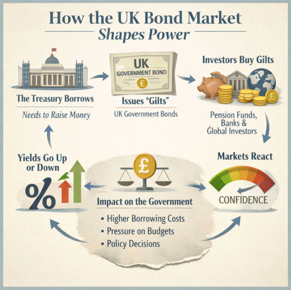
What is the bond market?
Imagine the government needs money – not for a rainy day, but for everything from schools to pensions to defence to the NHS. Taxes cover some of it, but not all. The gap between what the government spends and what it collects is filled by borrowing.
To borrow, the government issues bonds – IOUs that promise to pay interest over time.
These bonds are bought by:
pension funds
insurance companies
banks
investment firms
foreign governments
and large institutional investors
They buy bonds because they want a safe place to store money and earn a predictable return.
In other words:
The bond market is the place where governments borrow the money they need to function.
Why does the bond market matter so much?
Because the government depends on it.
If investors trust the government, they lend cheaply.
If they lose trust, they demand higher interest – or stop lending altogether.
This is why the bond market is often described as the “referee” of government behaviour. It doesn’t shout. It doesn’t campaign. It doesn’t issue statements. It simply reacts.
And its reactions have consequences.
What happens when the bond market gets nervous?
When investors worry that a government is spending too much, taxing too little, or losing control of the economy, they sell its bonds.
When they sell, the price of bonds falls.
When the price falls, the interest rate (the “yield”) rises.
When yields rise, government borrowing becomes more expensive.
This is not a gentle nudge.
It is a financial shockwave.
Higher borrowing costs mean:
less money for public services
more money spent on debt interest
pressure to raise taxes
pressure to cut spending
and a shrinking ability to invest in anything new
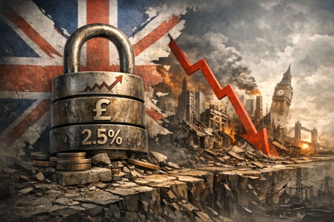
This is exactly what happened during the Liz Truss mini‑budget.
The markets didn’t “punish” her. They simply lost confidence – and reacted automatically.
Why can’t governments just ignore the markets?
Because the way government works today means that it needs to borrow constantly.
Not once a year.
Not once a decade.
Every single week.
The UK rolls over old debt and issues new debt continuously. If investors stop buying, the government cannot fund itself.
This is why no government – left, right, or centre – can simply “tell the markets to fall in line.” It would be like telling your bank manager that you don’t feel like paying interest anymore.
The system doesn’t work that way.
Why does this feel so disconnected from everyday life?
Because the bond market operates in a world most people never see.
When you hear politicians talk about “growth,” “fiscal rules,” or “market confidence,” they are speaking to this invisible audience – not to the public.
And when they talk about “growth,” they mean GDP, not the kind of growth people actually feel in their lives.
GDP can rise while:
wages stagnate
services decline
inequality widens
and communities fall apart
So when politicians celebrate “growth,” they are often signalling to the markets that the system is still functioning – not announcing that life is about to get better.
This is why the public hears optimism while politicians feel fear.
So who really holds the power?
Not in a conspiratorial sense – but in a structural one:
The bond market holds more power over government spending than any manifesto ever written.
It doesn’t care who wins elections.
It doesn’t care about ideology.
It doesn’t care about promises.
It cares about one thing:
Whether the government looks like a safe bet.
If it does, borrowing stays cheap.
If it doesn’t, the system tightens like a vice.
Why does this matter now?
Because Britain’s fiscal position is fragile:
debt is high
interest costs are rising
public services are stretched
productivity is weak
and the economy is heavily dependent on imported energy and goods
This means the next government – any government – will face extremely limited room for manoeuvre.
Not because they lack ideas.
Not because they lack ambition.
But because the system they inherit is already at its limits.
The uncomfortable truth
The bond market is not the enemy.
But it is not a neutral observer either.
It is the mechanism through which decades of political decisions – outsourcing, deregulation, financialisation, and dependence on debt – have come home to roost.
And until the public understands how this system works, the gap between political promises and political reality will continue to widen.
Because the truth is simple:
The bond market doesn’t take orders.
It sets the boundaries within which politics now operates.
And any politician who cannot explain that – or refuses to – is not being honest about the world we live in.
The debate over the future of the State Pension triple lock is often framed as a simple question of fairness: should pensions rise each year by the highest of inflation, wage growth or 2.5%? But the timing of Reform UK’s recent pledge to retain the policy – announced immediately after the party removed its housing spokesperson over comments about the Grenfell tragedy – highlights something more political than economic. The announcement reflected the sensitivity of the moment, not a deeper understanding of what the triple lock represents within the wider economic system.
The triple lock itself, introduced in 2010 by the Conservative–Liberal Democrat coalition and applied since 2011, was designed to ensure the State Pension kept pace with living costs. On paper, it is a straightforward mechanism. In practice, it has become a symbol of intergenerational tension and a lightning rod for wider anxieties about the sustainability of the welfare state.
Yet much of the public debate rests on a misunderstanding – not of the triple lock, but of the system that surrounds it.
The National Insurance Illusion
A significant part of the resentment directed at pensioners – and at benefit claimants more broadly – stems from a widespread belief that National Insurance functions like a personal contribution scheme. The idea is simple: pay in during working life, draw out later if needed. It is a reassuring narrative, and one that shapes how people judge who is “deserving” of support.
But it is not how the system works.
National Insurance is, in practice, another form of taxation. It creates the impression of a ring‑fenced fund, but the money is not stored or invested on behalf of contributors. It flows into the wider fiscal system, supporting pensions, disability benefits, the NHS and more. The distinction between NI and income tax is largely psychological – a way of obscuring the true scale of the tax burden.
This misunderstanding fuels the belief that some groups are “taking out” more than they “put in”.
Pensioners are portrayed as receiving disproportionate benefits, while claimants are accused of drawing on funds they have not earned. Yet both groups are navigating a system shaped not by individual choices, but by structural economic forces that have made independent living increasingly difficult.
Few pensioners enjoy the “gold‑plated” incomes often imagined. And for many, the wealth tied up in property is not liquid wealth at all – it is simply the roof over their heads.
A Safety Valve in a Distorted Economy
The official justification for the triple lock is to protect pensioners from falling living standards. But its deeper purpose is more systemic.
It acts as a safety valve in an economy where wages have failed to keep pace with the cost of living for years, and where millions rely on top‑up benefits simply to survive.
Recent calculations suggest that the real minimum income required for independent living is around £14.92 per hour for a full‑time worker – far above the statutory minimum wage. In this context, the triple lock is not generosity. It is a stabiliser in an economy where the fundamentals no longer align with the lived reality of ordinary people.
The triple lock attracts scrutiny precisely because it exposes this gap: the distance between what the economy delivers and what people need to live.
The Extractive System Behind the Debate
To understand why the triple lock is under pressure, it is necessary to look at the broader economic model. Since the financial crisis of 2007–08 – when the Labour government bailed out the banks on the grounds that they were “too big to fail” – the UK has relied increasingly on debt‑fuelled growth. Public money, or rather public borrowing, was used to stabilise a financial system whose own excesses had caused the crash.
The result was an acceleration of an extractive economic system: one that draws value out of industry, infrastructure and natural resources faster than it replaces them.
Over time, this leaves the state with fewer productive assets and greater reliance on financial engineering to keep the system afloat.
The Covid‑19 pandemic and the war in Ukraine intensified these pressures. Government spending surged, supply chains fractured, and inflation returned with a force not seen in decades.
In such an environment, policies like the triple lock become both more expensive and more politically contentious – even as they become more essential for those who rely on them.
Reform UK and the Politics of Constraint
Reform UK’s pledge to retain the triple lock, while simultaneously promising deep cuts to welfare, illustrates the bind facing all political parties.
The party argues that reducing benefits will free up resources to protect pensioners. But most people receiving benefits are not living comfortably; they are surviving on the margins of a system that no longer delivers affordable housing, adequate wages or predictable costs.
The irony is that many of the people who would be affected by such cuts were encouraged to come to the UK in the first place to sustain a model that depends on population growth and consumer spending to generate GDP. The same pounds circulate through the economy, creating the appearance of growth even when underlying productivity is stagnant.
Reform’s position is not unique. Every major party faces the same structural constraints. None can deliver the full range of promises they make without confronting the underlying economic model – something no mainstream political actor has yet been willing to do.
There is, ultimately, no way to rob Peter to pay Paul when both are already struggling.
A System at Its Limits
The triple lock debate is therefore not really about pensioners. It is about a system approaching the limits of what can be sustained through borrowing, population growth and statistical measures of economic activity.
When the government can no longer create enough debt to paper over the cracks, policies like the triple lock become flashpoints.
The question is not whether the triple lock is fair. It is whether the economic model that makes it necessary can continue in its current form.
Conclusion
The triple lock has become a symbol of a deeper truth: Britain’s cost‑of‑living crisis is not a temporary shock but a structural feature of an economy that no longer aligns with the needs of its people.
Pensioners are not the cause of this problem, nor are benefit claimants. They are simply the most visible participants in a system that has been stretched to breaking point.
The debate over the triple lock is, in the end, a debate about the future of the UK’s economic model – and whether any political party is prepared to confront the realities that underpin it.