You’re not imagining it. You’re not being dramatic. You’re not “doomscrolling yourself into a panic.” Much of what we see in the world outside our homes and communities is breaking down – and the reason so many of us have been questioning ourselves is because the people who have power and responsibility keep speaking and acting as if nothing is wrong.
Government isn’t functioning. Politics isn’t working. The public sector isn’t delivering. The prices of everything are becoming increasingly unaffordable. People sound angrier than they used to. The world outside our doors doesn’t feel safe.
And while there are plenty of loud voices shouting about what’s wrong, very few of them offer ideas or solutions that actually sound like they would work. Most of what we hear either feels too simplistic or too complex to make any sense of.
I’m not going to try to talk you through every reason things have become as unstable as they are – not here. There’s simply too much to cover, and trying to cram it all into one place would overwhelm you rather than help. If you want to understand what’s happening, why it has happened, and what we all need to start thinking about next, I can point you to other pieces that will help you ask the right questions and find your footing.
What you do need right now is space. Space to think. Space to ask questions. Space to connect with people who are putting reason before fear and who want to find a way forward that works for everyone – not just for themselves.
And you shouldn’t feel bad for asking this question. Many others are having the same thoughts and feelings you are.
Mainstream media talks around the edges of what matters, touching the surface but rarely explaining anything in a way that helps. Social media is full of people saying the things we want to hear – confirming that our feelings are real – but that’s usually where it stops.
The time has come to look, ask, read, listen, consider, and act in ways that make sense to you, rather than relying on what someone else says.
You’re not alone in feeling this way. And you’re not wrong to ask.
Every year, the Trussell Trust releases its food bank statistics. And every year, the same ritual unfolds.
This time, a headline announces that more than 2.6 million emergency food parcels were distributed in the past 12 months.
Commentators share the figure. Some frame it provocatively. And the replies fill with denial, contempt, and moral judgement.
But the real problem isn’t the trolls.
It’s that even people who donate to food banks, volunteer in them, or support them politically can still misunderstand what these numbers actually represent.
We think we know what poverty looks like.
We think we know who “the poor” are.
We think we know why people need help.
But we don’t.
And our misunderstanding is not accidental – it is cultural, psychological, and deeply tied to our discomfort with the economic system we all live inside: a system that depends on impoverishing people, then teaches them to feel guilty for being poor.
This essay is about that misunderstanding.
It’s about the stories we tell to avoid seeing the truth.
And it’s about what poverty quietly reveals about all of us.
Part I – What Food Banks Really Are
2. Food banks are not what people think they are
The public imagination treats food banks as if they are walk‑in supermarkets for freeloaders.
This is a myth – and a very damaging one.
To access a Trussell Trust food bank:
• a recipient must obtain a referral voucher
• they must obtain that voucher from a professional agency such as a GP, school, social worker, housing officer, or Citizens Advice
• to get that referral, they must demonstrate that they are in immediate crisis
• and are typically then required to engage with follow‑up support services
This is not casual use.
It is not convenience.
It is not a lifestyle choice.
It is a last‑resort emergency system.
What a food parcel actually contains
A standard emergency parcel provides:
• three days’ worth of nutritionally balanced food
• tinned and dried goods
• basic toiletries
• baby supplies where needed
• sometimes fuel vouchers*
And a typical food bank will today offer recipients signposting to debt, housing, or benefits support – with access to organisations like Citizens Advice Bureau increasingly ‘on-site’.
It is not luxury.
It is not abundant.
It is not designed to sustain anyone long‑term.
It is designed to stop someone from falling off the edge.
* Food poverty and fuel poverty rarely exist in isolation. The same financial pressure that empties cupboards also leaves homes unheated – forcing people to choose, daily, between food and warmth.
3. What the figures really say
When the Trussell Trust reports 2.6 million parcels, it does not mean:
• 2.6 million people are starving
• 2.6 million people are irresponsible
• 2.6 million people are “taking advantage”
It means:
2.6 million emergency interventions were needed to prevent people from going hungry in a wealthy country.
And that number only counts the people who:
• knew help existed
• were willing to ask
• could overcome the shame
• could navigate the referral system
• could physically reach a food bank
• and were not turned away because supplies ran out
The real number of people struggling is far higher.
Part II – The Invisible Reality
4. The millions who never ask for help
There are people in this country – thousands, maybe millions – who:
• skip meals
• water down food
• eat once a day
• pretend they’ve already eaten so their children don’t worry
• live on toast
• live on cereal
• live on nothing
And they will never go to a food bank.
Not because they don’t need help.
But because they believe:
• asking for help is shameful
• poverty is a personal failure
• “other people need it more”
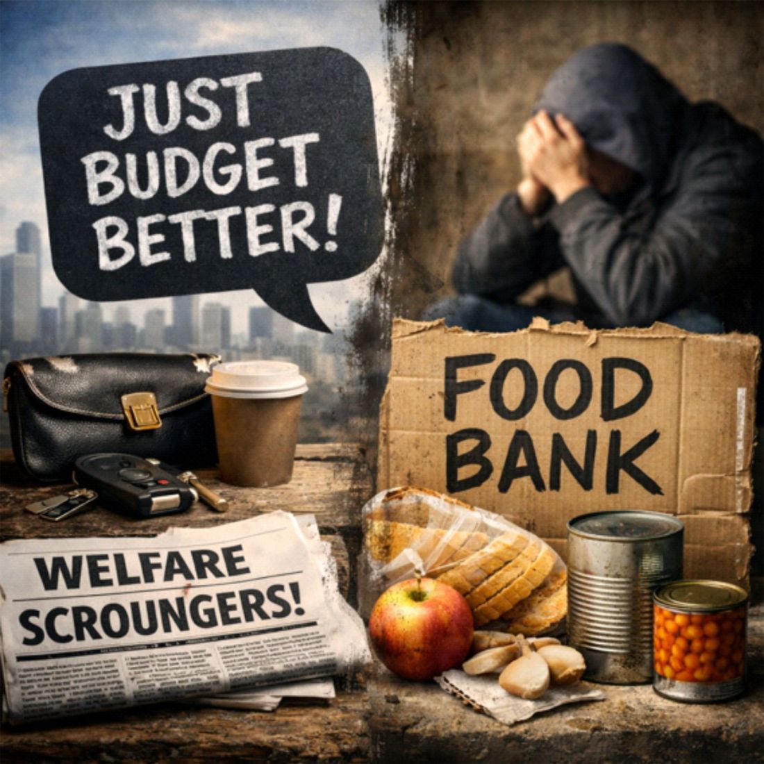
• they should “just budget better”
• they should “cope”
• they should “manage”
These beliefs do not come from nowhere.
They are the product of decades of political messaging, media framing, and cultural conditioning that equates poverty with moral weakness.
The result is a population suffering in silence – invisible to the statistics, invisible to policymakers, and invisible to the very volunteers who believe they are seeing the whole picture.
5. The uncomfortable truth about volunteers
Food banks are run by good people.
People who care.
People who give their time.
People who want to help.
But care is not the same as understanding.
Many volunteers have never experienced poverty themselves.
They have never had a debt collector at the door.
They have never had a benefits sanction.
They have never had to choose between heating and eating.
They have never had a car breakdown that wiped out their month.
They have never had a rent increase that tipped them into crisis.
For some, especially those whose own lives were made stable by wages, housing, pensions, or public services that worked better for them, the system does not look broken. It looks normal.
So when someone turns up for help, they do not always see a system producing poverty.
They see an individual in difficulty.
And once poverty is seen as an individual difficulty rather than a social outcome, the old explanations return:
• bad choices
• poor budgeting
• irresponsibility
That is where charity can become dangerous.
Charity treats the consequences of poverty. Understanding challenges the causes.
Without that understanding, some of the people helping the most visibly can end up helping the least politically, because the suffering is managed, softened, and made bearable – but the system that produces it is left untouched.
This is not a call to stop helping. It is a demand that help stops pretending the crisis begins and ends at the food bank door.
Part III – The System That Creates Poverty
6. The system that punishes default
Here is the part almost nobody talks about:
Most people are far closer to needing a food bank than they realise.
All it takes is:
• a missed paycheque
• a rent increase
• a benefits delay
• a car repair
• a boiler breakdown
• a relationship ending
• a sudden illness
• a debt repayment tipping the balance
The system is not designed to absorb shocks.
It punishes them, then calls the punishment consequence.
If you default on:
• a loan
• a subscription
• a utility bill
• a credit card
• a rent payment
…the system responds with:
• fees
• penalties
• interest
• threats
• collections
• court action
Miss a payment, and you do not simply fall behind. You are charged for falling behind. Penalised for having too little. Pursued because the margin was never there in the first place.
This is not a neutral system of personal responsibility.
This is structural fragility turned into a revenue stream.
The modern household budget is a tightrope.
One gust of wind – one unexpected bill – and the fall is immediate.
7. The devaluation nobody talks about
People often say “inflation is the problem”.
But inflation is only half the story.
The other half is:
Incomes are failing to keep pace with the cost of staying alive.
People aren’t just running harder because prices are rising.
They’re running harder because wages, benefits, and savings buy less against:
• rent
• food
• energy
• transport
• childcare
• debt
• housing
• council tax
• essentials
This is why even people who mock food bank users are often only a few bad weeks away from needing one themselves.
The system is extractive by design because every pressure point becomes an opportunity to take more.
It pulls value upward.
It pushes risk downward.
And it leaves ordinary people running faster and faster just to stay in place.
Part IV – The Narratives That Protect Us From The Truth
8. The collapse of public understanding
This is why social media threads about poverty become so toxic.
A provocative framing.
A misunderstood statistic.
A platform that rewards outrage.
A public conditioned to blame individuals.
A population under financial pressure.
A culture that equates poverty with moral failure.
The result?
A thread full of people:
• denying the problem
• mocking the vulnerable
• insisting it’s all about budgeting
• projecting their own financial fear onto others
• performing toughness to avoid confronting fragility
This is not ignorance.
It is self‑protection.
If poverty is a personal failure, then those who are not poor can reassure themselves that they are safe.
If poverty is structural, then nobody is safe.
And that is a far more frightening truth.
9. What poverty reveals about us
Poverty makes us uncomfortable because:
• it exposes the fragility of our own financial lives
• it reveals how dependent we are on a system we don’t control
• it reminds us that our stability is conditional
• it challenges the myth that hard work guarantees security
• it forces us to confront the extractive nature of the economy
• it shows us that “success” is often luck dressed up as virtue
We prefer to believe:
• “I’m safe because I’m responsible”
• “I’m secure because I work hard”
• “I’m stable because I make good choices”
But poverty whispers a different truth:
You are not as far from the edge as you think.
And that is why we cling to narratives that blame the poor.
Because if poverty is a moral failing, then we can pretend we are morally safe.
Part V – What We Must Change
10. The truth we keep refusing to face
Food banks are not a sign of generosity.
They are a sign of failure.
They are charity doing emergency repairs on an evolving political and economic crisis.
They exist because:
• wages don’t match living costs
• benefits don’t cover essentials
• housing is unaffordable
• debt is punitive
• work is insecure
• crises are common
• safety nets are thin
• shame is weaponised
• narratives are distorted
• charity is mistaken for a solution
And the people who use food banks are not the problem.
The problem is a society that:
• denies structural causes
• blames individuals
• moralises hardship
• misunderstands the data
• and refuses to see how close everyone is to the edge
11. Changing the story
If we want to fix the problem, we have to fix the story.
We need to stop talking about:
• “starving people”
• “scroungers”
• “budgeting failures”
• “irresponsibility”
And start talking about:
• crisis
• fragility
• structural pressure
• systemic failure
• the invisible millions
• the truth behind the numbers
• the difference between treating consequences and challenging causes
Because charity treats the consequences of poverty. Understanding challenges the causes.
And until we understand the causes, we will keep protecting the system that makes charity necessary.
For years, Britain’s debate about welfare has been framed as if it were a moral failing, a partisan indulgence, or a political choice. But the truth is far more uncomfortable for Westminster than any of the slogans they trade across the despatch box.
Welfare is no longer a safety net. It is the last structural support holding up an economic system that no longer pays people enough to live.
And now, with recently surfaced comments from a Labour figure – remarks clearly never intended for public release – we have a rare glimpse of what politicians say behind closed doors.
The suggestion that they are exploring “ways to tax people to pay for the rising cost of benefits” is not just politically clumsy. It is revealing.
It suggests a political mindset that treats welfare as a fiscal burden to be funded, rather than as a symptom of a broken economic model.
A System Built on Dependency – But Not the Kind Politicians Talk About
Across successive governments, the UK has drifted into an economic model that no longer makes people self‑sufficient.
Instead, it makes them dependent – on low wages, high living costs, debt, corporate landlords, and ultimately the state.
This did not happen by accident. It emerged from decades of policy choices that:
suppressed wages
inflated housing costs
centralised supply chains
financialised essentials
hollowed out local economies
The result is a country where millions of people in full‑time work cannot meet basic living costs without state support. Not because they are failing – but because the system is.
Yet the political class still talks about welfare as if it were a behavioural tool or a lifestyle subsidy. Too often, they appear to misunderstand both the system they inherited and the one they have helped to create.
Welfare Has Become Structural Infrastructure
The rising cost of welfare is not a sign of moral decline. It is a sign of economic decline.
For some, welfare now performs the function wages used to perform.
For many more, it fills the gap between what people earn and what it costs to live.
It is not optional.
It is not a luxury.
It is not a political indulgence.
It is the pressure valve preventing a system built on extraction and unaffordable living from blowing itself apart.
The Right is Painting Itself into a Dangerous Corner
The rhetoric from the political right has become increasingly absolutist:
“Cut benefits.”
“End dependency.”
“Make work pay.”
“Shrink the state.”
But work often does not pay enough to cover basic living costs, even on full-time hours.
So when the right promises to slash welfare, it risks removing one of the only things preventing:
mass arrears
mass evictions
mass hunger
mass debt defaults
and, ultimately, mass unrest
That is a dangerous gamble with the dam already under strain.
Labour’s Problem is Different – But Just as Dangerous
Labour’s instinct is to preserve welfare, but not to fix the system that makes welfare necessary.
Instead of confronting the structural drivers – rent extraction, corporate pricing power, broken local economies, and wages that lag far behind living costs – Labour reaches for the language of “responsibility” and “funding the welfare state.”
To many readers, this can sound like political code for:
“We will ask the public to pay more to sustain a broken system we remain reluctant to reform.”
The recently surfaced comments suggest that Labour recognises the system is under strain, yet still stops short of confronting its root causes. The approach can look less like structural repair and more like plugging holes in the dam.
The fact these words were not meant to be public does not make them better.
If anything, it makes them more revealing.
It suggests that even behind closed doors, the focus may be less on fixing the system than on finding ways to fund its dysfunction.
What Politicians Say Privately vs What They Tell the Public
One of the most revealing aspects of this moment is the gap between the public narrative and the private conversation.
Publicly, politicians talk about:
“supporting working families”
“making work pay”
“responsible public finances”
“helping people into good jobs”
Privately, the conversation is probably far blunter:
the welfare bill is rising faster than they can politically justify
wages are not keeping up with living costs
the housing market depends on high rents and high benefits
the economy cannot function without topping up millions of low incomes
and they have no plan to fix the underlying system
This is the part the public rarely sees – not necessarily because it is hidden maliciously, but because political language often obscures more than it reveals.
Those who follow politics closely, or who understand the context behind internal documents, leaks, and strategic briefings, can see the real picture clearly:
Britain’s welfare system is not a moral debate. It is a structural necessity created by decades of political choices.
The truth appears in fragments:
internal memos
off-record briefings
think-tank papers
leaked strategy documents
and the occasional unguarded remark
It is all there for anyone who knows how to read it.
But much of this remains obscure to the public, partly because political language can hide the scale of the crisis as much as explain it.
The leaked Labour comment matters not because it is shocking, but because it appears to confirm what many observers have long suspected:
Behind the scenes, politicians may be less focused on fixing the system than on containing its pressures.
In practice, that can amount to managing decline.
The Dam is Cracking
The human reality of life on benefits is not the caricature pushed by commentators or culture warriors. For many, it is a bureaucratic maze, a financial trap, and a constant source of stress and humiliation.
But too often, the political class responds to the numbers more readily than to the lives behind them.
They see rising welfare spending and conclude that the solution is to cut.
They see rising housing benefit and conclude that the solution is to “incentivise work.”
They see rising Universal Credit rolls and conclude that the solution is to tighten sanctions.
Too often, they treat the symptom while leaving the disease untouched.
If They Cut Welfare Without Structural Reform, the System Will Break
This is the central risk.
If politicians cut welfare without rebuilding the economic foundations that make welfare necessary, the consequences could be immediate and severe.
Because welfare is not the problem.
Welfare is the compensation mechanism for the problem.
Remove it, and the underlying crisis is exposed instantly.
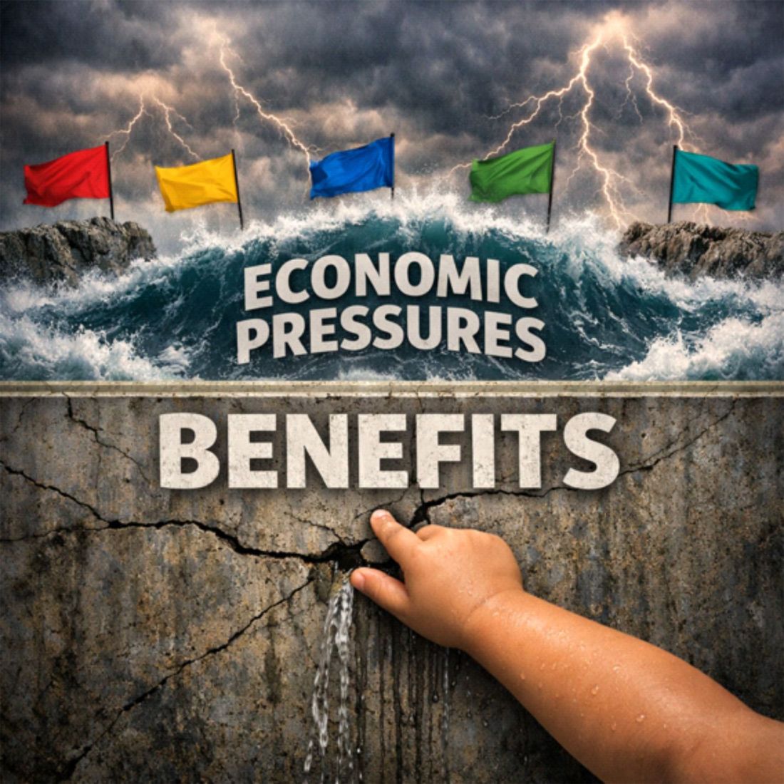
The Finger in the Dam
Welfare is the little boy’s finger in the dam.
For too many, it is what stands between today’s fragile equilibrium and:
homelessness
hunger
civil disorder
political extremism
and systemic collapse
Politicians who promise to cut benefits without rebuilding the economic foundations are not necessarily offering “tough love.”
They may instead be inviting structural failure.
That is a serious gamble.
And they may be underestimating the forces they are about to unleash.
Conclusion
Welfare is not the cause of Britain’s crisis. It is the last fragile barrier preventing that crisis from becoming visible.
The political class – left and right – has spent decades misdiagnosing the problem, blaming the people caught in the system rather than the system itself.
But if they continue down the path of cutting benefits without rebuilding the economic foundations that make benefits necessary, they will not be saving the country money.
They will be breaking the dam.
And when it breaks, it will not be the poor alone who are swept away.
It will be the entire political order that created this mess and refused to understand it.
Further Reading
To understand how Britain reached the point where welfare has become the last structural support holding up a broken economic system, the following pieces explore the deeper causes, consequences, and interconnected failures that have shaped this crisis.
Each article builds on the last, tracing the slow drift from economic balance to systemic fragility.
Explores how decades of incremental policy decisions – none catastrophic on their own – collectively hollowed out Britain’s economic resilience. It sets the stage for understanding why welfare became structural rather than temporary.
Examines how political and economic fragmentation led to short‑term thinking, siloed policymaking, and a failure to see the economy as a connected system – a key reason reform efforts keep missing the mark.
2. The Economic Mechanics Behind Welfare Dependency
Deconstructs the illusion of wealth creation in modern Britain – showing how asset inflation and debt have replaced genuine productivity, leaving households dependent on welfare to bridge the gap.
Connects the dots between stagnant wages, rising living costs, and the structural need for welfare. It explains why welfare spending keeps rising even when employment figures look strong.
Shows how the “working poor” have become the backbone of the welfare system – not through choice, but through necessity. It highlights the mismatch between official narratives about work and the lived reality of millions.
Explores the widening divide between those insulated from economic shocks and those living permanently on the edge. It argues that this split is now cultural as much as financial.
Analyses how populist and establishment politics alike have become trapped in a cycle of blame and short‑term fixes. It warns that cutting welfare without reforming the underlying system will trigger social and economic instability.
Suggested Reading Order
What Happened to Britain – the long view of decline
Britain’s Hidden Problem – how fragmentation deepened the crisis
Why Wealth Isn’t What You Think It Is – the illusion of prosperity
The Exploding Cost of Welfare – the structural inevitability
When Work Isn’t Enough – the lived reality of working poverty
The Real Two‑Tier Britain – the social divide
Being on Benefits Isn’t a Culture – the human cost
Benefits Culture, and System‑Locked Politics – the political consequences
Closing Note
Together, these pieces form a coherent narrative: Britain’s welfare system didn’t fail because people became dependent – it became essential because the economy did.
Understanding this progression is key to seeing why welfare is not the problem, but the last fragile barrier preventing the system itself from collapse.
“Truth does not vanish when ignored; it waits beneath the data for someone to notice.” – Adam Tugwell
A Note from Adam
In January 2025, I asked a question on social media that had been bubbling in my mind for a long time:
Has anyone found a formula to give the rate of impoverishment for people – the reduction in the value of money held or promised as earnings – in direct proportion to the rate of economic “growth”?
There were no replies.
That silence was telling. Not because of reach or algorithms, but because almost no one is thinking about impoverishment as a measurable process – even though it is happening in real time, to millions of people, in ways that are getting worse and more destructive with each passing year.
The lack of response didn’t discourage me. It confirmed the need for this work.
The Impoverishment Index grew out of that moment of quiet. It is part of a much wider body of systems work I have been developing for years – work focused on understanding how societies function, how they fail, and what must change if we are to build something better.
At the heart of that work is a simple truth: systems collapse when the stories they tell no longer match the reality people live.
Today, we are living through such a collapse.
Not sudden, not dramatic – but slow, cumulative, corrosive.
A system that concentrates wealth at the top while eroding the foundations beneath everyone else.
A system that rewards extraction over contribution.
A system that produces growth without prosperity, and prosperity without security.
A system that is, in all practical terms, impoverishing the many so that the few may become fabulously rich.
This report is not an act of ideology. It is an act of clarity.
It is an attempt to measure what is really happening – not what we are told is happening.
It is an attempt to give language and structure to a process that has been allowed to remain invisible for far too long.
The tweet that began this journey is included here not because it went viral, but because it didn’t.
Because silence is data.
Because the absence of conversation is itself a symptom of the problem.
And because sometimes the most important questions are the ones no one else is asking.
This work is for those who feel the strain but cannot explain it, who sense the decline but cannot quantify it, who know something is wrong but are told everything is fine.
It is for those on the wrong side of the system – whether they realise it yet or not.
1. Executive Summary
Across the United Kingdom, a growing number of people report feeling financially strained, insecure, and increasingly unable to maintain the standard of living they once took for granted. Yet official statistics often paint a far more optimistic picture: wages are rising, inflation is easing, and the economy is expanding. This contradiction has created a profound sense of confusion and frustration – and for many, a feeling of being gaslit by the very institutions meant to inform them.
This report introduces The Impoverishment Index, a new framework designed to bridge the gap between the accepted narrative and the lived experience. It provides a clearer, more honest measure of economic wellbeing by combining three forces that shape people’s daily lives:
Inflation – the rate at which the value of money is eroded
Wage growth – the rate at which pay changes
GDP growth – the rate at which the wider economy moves ahead of workers
Using the latest official data, the index reveals that:
The value of the pound has fallen significantly
Wages have barely kept pace with prices
The economy has grown faster than workers’ pay
Cash savings have lost substantial real value
The majority of households are experiencing a real decline in living standards
These findings align closely with what people feel, even as headline figures suggest improvement.
The Impoverishment Index demonstrates that the strain felt by millions is not a personal failing, nor a sign of poor financial management. It is a measurable, systemic issue that has been obscured by narrow or misleading economic indicators.
By presenting a more complete picture of economic reality, this report aims to restore clarity, honesty, and dignity to the national conversation about living standards — and to show that those who feel left behind are far from alone.
2. Introduction: The Gap Between Narrative and Reality
For more than a decade, the national conversation about the economy has been shaped by a steady stream of reassuring headlines. We are told that wages are rising, inflation is easing, and the economy is returning to growth. These messages are repeated by government departments, economic commentators, and major news outlets. On paper, the story appears to be one of gradual improvement and cautious optimism.
Yet for millions of people across the United Kingdom, this narrative bears little resemblance to their daily lives.
Households report feeling more financially stretched than ever. The weekly food shop costs more. Rent and mortgage payments have risen sharply. Energy bills remain elevated. Savings have been eroded. Disposable income feels tighter, not looser. And the sense of financial security that once came from steady work has weakened.
This disconnect between the official story and the lived experience has created a profound sense of confusion and frustration.
Many people feel as though they are being told one thing while experiencing another. Some describe feeling gaslit – as though their struggles are invisible or invalid because the data suggests they should be coping.
This emotional dissonance is not a trivial matter. It affects mental health, trust in institutions, and the social fabric of communities. When people believe they are alone in their struggles, they internalise blame. They assume they are failing personally, even when the pressures they face are systemic.
The purpose of this report is to bridge that gap.
The Impoverishment Index provides a clearer, more honest measure of economic wellbeing – one that reflects the reality of people’s lives rather than the narrow lens of traditional economic indicators. It does not replace official statistics; instead, it complements them by capturing what they miss.
By combining inflation, wage growth, and GDP growth into a single, intuitive framework, the index reveals the true trajectory of living standards in the UK. It shows that the strain felt by millions is not imagined, not exaggerated, and not a sign of personal mismanagement. It is a measurable, widespread phenomenon that has been obscured by incomplete or misleading narratives.
This report aims to restore clarity to the conversation about living standards – and to show that those who feel left behind are far from alone.
3. Summary of Findings
The Impoverishment Index reveals a clear and measurable pattern: living standards in the United Kingdom have been under sustained pressure, even during periods when headline indicators suggest improvement. The key findings are as follows:
• Real wages have stagnated After adjusting for inflation, wage growth has been close to zero for an extended period. Workers are not meaningfully gaining ground.
• The economy has grown faster than pay GDP growth has consistently outpaced real wage growth, meaning workers are falling behind the wider economy.
• Inflation has eroded the value of money Even as inflation has eased from its peak, the cumulative effect has significantly reduced purchasing power.
• Cash savings have lost substantial real value The combined effect of inflation and economic growth has sharply reduced the real and relative value of holding cash.
• Households feel the squeeze because the squeeze is real The Index confirms that the financial strain reported by millions is not imagined. It is a systemic outcome of the interaction between inflation, wages, and economic growth.
Together, these findings show that the official narrative of recovery and improvement does not reflect the lived experience of most households. The Impoverishment Index provides the missing context needed to understand why.
4. The Economic Illusion: Why Official Figures Mislead
For most people, the economy is not an abstract concept. It is not a spreadsheet, a quarterly release, or a line on a chart. The economy is the weekly food shop, the rent or mortgage payment, the energy bill, the cost of getting to work, and the amount left at the end of the month. It is the lived reality of whether life feels manageable or precarious.
Yet the indicators used to describe the economy – inflation, wage growth, GDP – often fail to reflect that reality.
They are technically accurate, but practically misleading. They create an illusion of improvement even when people’s circumstances are deteriorating.
This section explains why.
4.1 Inflation does not measure the cost of living
Inflation is presented as a single number, but no household experiences inflation in the same way.
The official measure, CPIH, includes hundreds of items that many households rarely buy – televisions, furniture, recreational goods – while underweighting the essentials that dominate most budgets:
rent
mortgages
food
energy
transport
council tax
childcare
When essentials rise faster than the headline rate, the official inflation figure becomes detached from the real cost of living. A 3.3% CPIH rate may sound modest, but if your rent is up 9%, your food shop is up 12%, and your energy bill is still elevated, your personal inflation rate is far higher.
This is the first part of the illusion:
Inflation may be “falling”, but the cost of living is not.
4.2 Wage growth figures are distorted by averages
When the Office for National Statistics reports that wages are up 3.4%, it does not mean that your wages are up 3.4%.
The figure is a mean average, pulled upwards by:
high earners
London salaries
bonuses
job‑switchers
senior promotions
Meanwhile, millions of workers – especially those on lower incomes – see little or no nominal wage growth at all.
This creates the second part of the illusion:
Wages may be “rising”, but not for most people.
4.3 “Real wages” only adjust for inflation – not for the falling value of money
When inflation is 3.3% and wages rise 3.4%, official statistics say:
“Real wages are up 0.1%.”
But this calculation ignores the fact that the pound itself has lost value. A 3.3% rise in prices means every £100 you hold is now worth £96.70 in real terms.
Even if wages keep pace with inflation, the money you are paid with has already been diluted.
This is the third part of the illusion:
Real wages may be “up”, but the value of money is down.
4.4 GDP growth does not translate into personal wellbeing
GDP measures the size of the economy, not the wellbeing of the people in it.
When GDP grows faster than wages, workers fall behind in relative terms – even if wages keep up with inflation.
This matters because:
profits can grow faster than pay
asset values can rise faster than incomes
wealth can accumulate at the top
workers can fall behind even in a “growing” economy
This is the fourth part of the illusion:
The economy may be “growing”, but workers are not benefiting.
4.5 The combined effect: a narrative that feels untrue
When you put these distortions together, you get a national narrative that sounds positive:
inflation down
wages up
real pay rising
economy growing
But for millions of households, the lived experience is the opposite:
essentials up sharply
wages stagnant
savings eroded
disposable income shrinking
financial stress rising
This is why so many people feel as though they are being told one thing while experiencing another.
It is not because they misunderstand the data. It is because the data does not describe their reality.
The Impoverishment Index exists to correct this – by combining inflation, wage growth, and GDP growth into a single measure that reflects the real pressures on households.
5. The Impoverishment Index: A New Lens on Living Standards
The Impoverishment Index was created to answer a simple but increasingly urgent question:
Why do so many people feel poorer when the official figures suggest they should be better off?
The answer lies in the limitations of traditional economic indicators. Inflation, wage growth, and GDP each tell part of the story, but none of them captures the full picture of how people experience economic change.
When used in isolation, they can create a misleading narrative – one that suggests improvement even when living standards are stagnating or declining.
The Impoverishment Index brings these indicators together into a single, intuitive framework that reflects the real pressures facing households.
It does not replace existing measures; instead, it complements them by revealing what they miss.
5.1 The three forces shaping real living standards
The Impoverishment Index is built on three measurable forces that directly affect people’s financial wellbeing:
1. Inflation – the erosion of money’s value
Inflation reduces the purchasing power of every pound. Even modest inflation compounds over time, steadily eroding savings, wages, and disposable income. When essentials rise faster than the headline rate, the impact is even more severe.
2. Wage growth – the change in pay packets
Wage growth determines whether people can keep up with rising costs. But average wage figures often mask the reality for lower‑paid workers, part‑time employees, and those outside major cities.
3. GDP growth – the pace of the wider economy
GDP growth reflects how quickly the economy is expanding. When GDP grows faster than wages, workers fall behind in relative terms – even if wages keep up with inflation.
These three forces interact in ways that traditional statistics fail to capture.
The Impoverishment Index brings them together to reveal the true trajectory of living standards.
5.2 Two complementary measures
The Index consists of two components, each capturing a different aspect of economic pressure.
A. Wage‑Earner Impoverishment
This measures how far workers fall behind the wider economy. If the economy grows faster than real wages, workers lose ground – even if wages technically rise.
It answers the question:
“Are workers keeping pace with the economy?”
B. Cash‑Holder Impoverishment
This measures how fast cash loses value both in purchasing power (inflation) and relative to the expanding economy (GDP growth).
It captures the erosion of savings and the decline in the real value of money.
It answers the question:
“How quickly is the value of money shrinking?”
Together, these measures provide a more complete picture of economic wellbeing than any single indicator.
5.3 Why the Index is needed
The Impoverishment Index exists because traditional measures have failed to explain the lived experience of millions.
Wage growth figures hide the stagnation of lower earners
Real wages ignore the falling value of money itself
GDP growth does not reflect personal wellbeing
Official narratives often contradict daily reality
By combining these elements, the Index reveals the underlying pressures that shape people’s lives – pressures that have been building for years but remain obscured by narrow or incomplete statistics.
5.4 A clearer, more honest measure
The Impoverishment Index is not ideological. It does not assign blame or prescribe policy. Its purpose is clarity.
It provides:
a transparent method
a replicable calculation
a grounded interpretation
a bridge between data and lived experience
Most importantly, it validates what people already know intuitively:
Life has become harder, not easier, despite what the headlines suggest.
The Index gives voice to that reality – and gives policymakers, journalists, and the public a more accurate tool for understanding the true state of living standards in the UK.
6. Findings: What the Index Reveals
The Impoverishment Index brings together inflation, wage growth, and GDP growth to provide a clearer picture of how living standards are changing in the United Kingdom.
Using the latest official data, the Index reveals a pattern that aligns far more closely with the lived experience of households than with the headline economic narrative.
The findings are stark, but they are also clarifying. They show that the financial strain felt by millions is not imagined, not exaggerated, and not a sign of personal failure. It is a measurable, systemic trend.
6.1 The value of the pound has fallen sharply
Inflation remains one of the most powerful forces shaping household finances.
Even as the headline rate has eased from its peak, the cumulative effect of several years of elevated inflation has significantly eroded the value of money.
With CPIH inflation at 3.3%, every £100 now buys what £96.70 did a year ago. Over multiple years, this erosion compounds, reducing the real value of wages, savings, and benefits.
This is not a marginal effect. It is a structural shift in the purchasing power of the pound.
6.2 Wages have barely kept pace with prices
Nominal regular pay has risen by 3.4%, while inflation stands at 3.3%. This produces a “real wage increase” of just 0.1% – a figure so small it is effectively zero.
This means:
wages are not rising meaningfully in real terms
households are not gaining purchasing power
the average worker is treading water at best
For many workers – particularly those on lower incomes – wage growth has been even weaker than the average.
This means that millions have experienced a real pay cut, even as the national figures suggest stability.
6.3 The economy is moving ahead faster than workers’ pay
GDP has grown by 0.4%, outpacing the 0.1% rise in real wages.
This means workers have fallen 0.3% behind the wider economy.
This matters because:
when GDP grows faster than wages, inequality widens
profits and asset values rise faster than incomes
workers lose ground in relative terms
the benefits of growth accrue disproportionately to capital, not labour
This divergence helps explain why people feel left behind even in a “growing” economy.
6.4 Cash savings have lost substantial real value
The combination of inflation and GDP growth means that cash has lost 3.7% of its relative value.
This is the “invisible tax” on savers – a silent erosion that affects:
households with modest savings
pensioners relying on cash reserves
anyone unable to invest in inflation‑beating assets
This erosion is rarely discussed in public debate, yet it has a profound impact on financial security.
6.5 Essentials continue to rise faster than headline inflation
While CPIH stands at 3.3%, the categories that dominate household budgets have risen much faster:
food
rent
mortgages
energy
transport
council tax
For many households, the effective inflation rate is closer to 6–12%, depending on their circumstances.
This explains why the official inflation figure feels disconnected from reality.
6.6 The majority of households are experiencing a real decline in living standards
When the components of the Index are combined, the picture becomes clear:
the pound is worth less
wages have stagnated
the economy has moved ahead of workers
essentials have risen sharply
savings have been eroded
This is not a temporary fluctuation. It is a sustained trend that has been building for years.
The Impoverishment Index shows that the financial strain felt by millions is not a personal failing. It is the predictable outcome of economic forces that have been poorly measured, poorly communicated, and poorly understood.
7. The Human Impact: Why People Feel Strained
Economic statistics can feel abstract, but their consequences are not.
Behind every percentage point of inflation, every fraction of wage growth, and every line of GDP data lies a real human experience – the experience of trying to make ends meet in an environment where the ground seems to shift beneath your feet.
The Impoverishment Index helps explain why so many people feel financially strained, even when the official narrative suggests improvement.
But to understand the full picture, we must look beyond the numbers and consider the emotional, social, and psychological impact of prolonged economic pressure.
7.1 The quiet erosion of financial security
For many households, the most significant change over the past decade has not been a sudden crisis but a slow, steady erosion of financial security.
People describe a sense of “never quite catching up”, even when they work hard, budget carefully, and do everything “right”.
This erosion shows up in everyday life:
the food shop that costs a little more each month
the rent that rises faster than wages
the energy bill that never returns to pre‑crisis levels
the savings that don’t stretch as far as they used to
the unexpected expense that now feels like a threat
These pressures accumulate quietly, but their impact is profound.
7.2 The emotional toll of conflicting narratives
When the official story says:
“real wages are rising”
“inflation is easing”
“the economy is recovering”
…but your lived experience is:
“I’m struggling more than ever”
“my costs keep rising”
“I can’t get ahead”
…it creates a psychological dissonance.
People begin to question themselves:
Is it just me?
Am I bad with money?
Why can’t I cope when the data says I should be fine?
This sense of personal failure is one of the most damaging consequences of the gap between narrative and reality.
It isolates people at the very moment they most need reassurance that their experience is shared.
The Impoverishment Index helps close that gap. It validates what people feel, not what they are told to feel.
7.3 The rise of financial anxiety
Financial stress is no longer confined to those on the lowest incomes.
It has spread across the income distribution, affecting:
renters and homeowners
young families and older workers
public‑sector employees and private‑sector staff
people in cities and people in towns
The common thread is a sense of fragility – the feeling that one unexpected bill, one missed shift, or one interest‑rate rise could tip the balance.
This anxiety is not irrational. It is a rational response to an environment where wages stagnate, essentials rise, and the value of money falls.
7.4 The shrinking margin for error
A decade ago, many households had a buffer – a small savings pot, a bit of slack in the monthly budget, a sense that they could absorb a shock. Today, that buffer has eroded for millions.
The margin for error has shrunk.
This means:
fewer people can save
more people rely on credit
unexpected costs cause immediate stress
long‑term planning becomes difficult
financial resilience declines
This is not simply a matter of personal budgeting. It is the predictable outcome of economic forces that have outpaced wages for years.
7.5 The social impact: a shared struggle that feels private
One of the most striking findings of this report is not in the data itself, but in the conversations around it. People often believe they are alone in their struggles – that others are coping better, earning more, or managing more effectively.
In reality, the pressures described here are widespread.
Millions of households are experiencing the same strain, the same erosion of security, the same sense of falling behind.
But because the official narrative suggests improvement, many assume their difficulties are personal rather than systemic.
The Impoverishment Index helps correct this misunderstanding. It shows that the strain is real, measurable, and shared – and that no one is alone in feeling it.
7.6 A clearer understanding of lived experience
By grounding economic analysis in human experience, the Impoverishment Index provides a more honest account of life in the UK today. It explains why people feel poorer even when the data suggests they shouldn’t. It validates their experience, restores confidence in their own perceptions, and challenges the narratives that have obscured the truth.
Most importantly, it reconnects economic measurement with the reality of people’s lives – a connection that has been missing for far too long.
8. Distributional Effects: Who Is Hit Hardest
The pressures revealed by the Impoverishment Index are widespread, but they are not evenly distributed.
Some groups experience the erosion of living standards far more acutely than others.
Understanding these distributional effects is essential for interpreting the Index and for recognising why certain communities feel the strain more intensely.
This section outlines the groups most affected by the combined forces of inflation, wage stagnation, and economic divergence.
8.1 Low‑income households
Low‑income households are disproportionately affected for several reasons:
A larger share of their income goes on essentials such as food, rent, and energy – categories that have risen faster than headline inflation.
They have limited savings to buffer against rising costs.
They are less likely to receive pay rises that match or exceed inflation.
They are more exposed to insecure work, variable hours, and unpredictable income.
For these households, even small increases in essential costs can create immediate financial stress.
The Impoverishment Index captures this pressure more accurately than traditional measures.
8.2 Renters
Renters face some of the steepest cost increases in the UK. Private rents have risen significantly faster than wages in many regions, particularly in major cities and areas with limited housing supply.
Renters are affected by:
rising monthly payments
increased competition for available properties
limited security of tenure
the inability to build equity
higher energy costs in poorly insulated homes
Because rent is a non‑negotiable expense, rising housing costs have a direct and immediate impact on disposable income.
8.3 Households with mortgages
While homeowners are often perceived as more financially secure, many have faced sharp increases in monthly payments due to rising interest rates. For households on variable‑rate mortgages or those coming off fixed‑rate deals, the jump in costs has been substantial.
This group experiences:
higher monthly payments
reduced disposable income
increased financial anxiety
difficulty refinancing on favourable terms
The erosion of real wages compounds these pressures.
8.4 Younger adults and families with children
Younger adults and families face a unique combination of pressures:
childcare costs that outpace wage growth
higher rents relative to income
limited access to home ownership
student loan repayments
lower average savings
These factors make younger households particularly vulnerable to inflation and wage stagnation.
The Impoverishment Index reflects this vulnerability more clearly than traditional indicators.
8.5 Public‑sector workers
Public‑sector pay has lagged behind inflation for many years. Even when pay awards are made, they often fall short of the rise in living costs.
Public‑sector workers face:
real‑terms pay erosion
increased workload pressures
limited opportunities for rapid wage progression
This group includes teachers, nurses, social workers, and other essential workers whose living standards have been steadily eroded.
8.6 People living outside major cities
While London and some large cities have seen stronger wage growth, many towns and rural areas have experienced:
stagnant wages
limited job opportunities
higher transport costs
slower economic growth
The divergence between regions means that national averages mask significant local disparities.
8.7 Households relying on savings or fixed incomes
People who rely on savings, pensions, or fixed incomes are particularly exposed to inflation and the erosion of the pound’s value.
They experience:
declining purchasing power
reduced financial security
difficulty maintaining previous living standards
The Impoverishment Index’s cash‑holder measure captures this erosion directly.
8.8 A shared experience with unequal intensity
While the pressures described in this report affect a broad cross‑section of society, the intensity varies. Some groups face acute, immediate strain; others experience a slower, more gradual erosion of financial security.
What unites these experiences is the sense of falling behind – a feeling that the official narrative does not reflect the reality of daily life.
The Impoverishment Index helps make these differences visible, while also highlighting the common thread that runs through them: the widening gap between economic narratives and lived experience.
9. Long‑Term Trends: A Decade of Erosion
The pressures revealed by the Impoverishment Index did not emerge overnight. They are the result of long‑term economic trends that have gradually reshaped the financial landscape of the United Kingdom.
While recent inflation spikes and interest‑rate rises have intensified the strain, the underlying issues have been building for more than a decade.
This section examines the long‑term trajectory of living standards, showing how the erosion of financial security has become a defining feature of the post‑2010 economic era.
9.1 A decade of wage stagnation
Between 2010 and the mid‑2020s, wage growth in the UK has been historically weak. Adjusted for inflation, real wages have barely risen – and in many years, they have fallen.
This stagnation has several consequences:
workers have not shared in the gains of economic growth
disposable income has failed to keep pace with rising costs
younger generations have entered the workforce on lower real pay than their predecessors
wage progression has slowed across many sectors
The Impoverishment Index captures this stagnation by showing how wages have consistently lagged behind both inflation and GDP growth.
9.2 The rising cost of essentials
Over the same period, the cost of essentials has risen significantly faster than general inflation.
Key categories include:
housing – rents and house prices have outpaced wages
energy – bills have risen sharply, with major spikes in recent years
food – sustained increases driven by global supply pressures
transport – fuel, insurance, and public transport costs have climbed
childcare – among the highest in Europe
These increases disproportionately affect low‑ and middle‑income households, who spend a larger share of their income on essentials.
9.3 The erosion of savings and financial resilience
The past decade has seen a marked decline in household savings rates.
Several factors have contributed:
stagnant wages
rising living costs
increased reliance on credit
limited access to high‑return savings products
prolonged periods of low interest rates followed by sudden increases
As a result, many households now have little or no financial buffer. This makes them more vulnerable to shocks – whether personal, economic, or global.
9.4 The widening gap between GDP and wages
One of the most significant long‑term trends is the divergence between economic growth and wage growth.
While GDP has expanded over the past decade, wages have not kept pace.
This divergence has several implications:
a greater share of economic gains has gone to profits rather than pay
asset owners have benefited more than workers
inequality has widened
the average worker has fallen behind in relative terms
The Impoverishment Index captures this divergence directly through its wage‑earner component.
9.5 The compounding effect of inflation shocks
The inflation surge of the early 2020s did not occur in isolation.
It landed on top of:
a decade of wage stagnation
rising housing costs
declining savings
regional economic disparities
insecure work patterns
This meant households entered the inflation shock with far less resilience than in previous decades. Even as inflation has eased, the cumulative effect remains.
The pound today buys significantly less than it did ten years ago – and wages have not kept up.
9.6 The long‑term shift in economic risk
Over the past decade, economic risk has increasingly shifted from institutions to individuals.
Households now bear more responsibility for:
housing costs
retirement planning
childcare
energy bills
job security
financial resilience
This shift has left many people feeling exposed and unsupported, particularly during periods of economic volatility.
9.7 A decade of erosion, not a single crisis
The key insight from this long‑term analysis is that the current strain is not the result of a single event.
It is the cumulative outcome of:
slow wage growth
rising essential costs
inflation shocks
declining savings
regional disparities
structural economic changes
The Impoverishment Index brings these trends into focus, showing how they interact to create a sustained decline in living standards for millions.
This is why the strain feels so deep, so persistent, and so widespread. It is not a temporary setback. It is the result of a decade‑long erosion of financial security.
10. Implications for Policy, Media, and Public Understanding
The Impoverishment Index does more than measure economic pressure. It exposes a fundamental problem in how the United Kingdom understands and communicates economic reality.
The gap between official narratives and lived experience has grown so wide that it now affects public trust, policy effectiveness, and the national conversation about living standards.
This section outlines the implications of the Index for three key groups: policymakers, the media, and the public.
10.1 Implications for policymakers
Policymakers rely heavily on headline indicators such as CPIH, average wage growth, and GDP.
These measures are essential, but they are not sufficient. When used in isolation, they can create a misleading picture of economic wellbeing.
The Impoverishment Index highlights several risks:
A. Policy may be based on incomplete information
If inflation appears to be easing while essentials continue to rise sharply, policies aimed at “cost‑of‑living relief” may be withdrawn prematurely.
B. Wage policy may not reflect real pressures
Average wage growth can mask stagnation among lower‑paid workers. Policies based on averages risk overlooking those most affected.
C. Economic growth may be mistaken for rising living standards
GDP growth does not guarantee improvements in household wellbeing. The Index shows when growth is not translating into real gains for workers.
D. Public dissatisfaction may be misunderstood
When people feel poorer despite positive economic headlines, policymakers may misinterpret the cause as pessimism or misinformation rather than a genuine decline in living standards.
The Impoverishment Index provides a clearer foundation for understanding these pressures and designing responses that reflect real conditions.
10.2 Implications for the media
The media plays a crucial role in shaping public understanding of the economy. However, economic reporting often relies on headline figures without sufficient context.
The Index highlights several challenges:
A. Headlines can unintentionally mislead
Statements such as “real wages rise” or “inflation falls” may be technically correct but practically meaningless for many households.
B. Averages hide the distribution of experience
Reporting national averages without acknowledging variation can reinforce the sense that people’s struggles are personal rather than systemic.
C. The narrative can become detached from reality
When the media repeats optimistic economic messages that contradict lived experience, public trust erodes.
D. The public needs clearer explanations
Economic reporting often assumes a level of technical understanding that many readers do not possess.
The Impoverishment Index offers a simpler, more intuitive way to communicate economic pressures.
By incorporating the Index into reporting, the media can provide a more accurate and relatable account of the economy.
10.3 Implications for public understanding
For the public, the Impoverishment Index offers something that has been missing from the national conversation: validation.
Many people have spent years feeling that their financial struggles are personal failings.
They have been told that wages are rising, inflation is easing, and the economy is recovering – yet their own experience is one of increasing strain.
The Index helps to correct this misunderstanding.
A. It shows that the strain is real
The pressures people feel are not imagined. They are measurable and widespread.
B. It shows that the strain is shared
Millions of households are experiencing the same erosion of financial security.
C. It restores confidence in personal experience
People are not “bad with money”. They are navigating an economic environment that has become steadily more difficult.
D. It provides a clearer way to understand the economy
The Index translates complex economic forces into a simple, intuitive measure that reflects real life.
10.4 A more honest national conversation
The Impoverishment Index does not replace existing economic indicators. It complements them by revealing what they miss.
Its purpose is not to criticise institutions or challenge expertise, but to improve understanding.
By adopting a more holistic measure of economic wellbeing, the UK can:
improve the accuracy of public debate
strengthen trust in economic communication
design policies that reflect real conditions
reduce the sense of isolation felt by struggling households
create a more honest and empathetic national narrative
The Impoverishment Index is a tool for clarity – and clarity is the foundation of effective policy, responsible journalism, and informed public understanding.
11. Conclusion: A More Honest Measure of Economic Wellbeing
The United Kingdom is experiencing a profound disconnect between the story told by official economic indicators and the reality lived by millions of households.
For years, the national narrative has emphasised rising wages, easing inflation, and steady economic growth. Yet for many people, life has become harder, not easier. Their money buys less. Their wages stretch thinner. Their financial security feels increasingly fragile.
The Impoverishment Index helps explain why.
By bringing together inflation, wage growth, and GDP growth into a single, intuitive framework, the Index reveals the pressures that traditional indicators obscure. It shows how the value of money has eroded, how wages have stagnated, and how the economy has moved ahead of workers. It captures the cumulative effect of a decade of slow wage growth, rising essential costs, and declining financial resilience.
Most importantly, it validates what people already know in their bones:
The strain they feel is real, widespread, and measurable.
The Index does not assign blame. It does not advocate for specific policies. Its purpose is clarity – to provide a more honest measure of economic wellbeing and to bridge the gap between narrative and reality.
For policymakers, it offers a clearer foundation for understanding the pressures facing households.
For journalists, it provides a more accurate way to communicate economic change.
For the public, it restores confidence in their own lived experience.
The Impoverishment Index is not just a new metric. It is a tool for rebuilding trust – trust in economic communication, trust in public institutions, and trust in the idea that people’s experiences matter.
By adopting a more complete and honest measure of living standards, the UK can begin to rebuild that trust and create a national conversation that reflects the reality of people’s lives, not just the numbers on a spreadsheet.
The message of this report is simple but vital:
You are not imagining it. You are not alone. And you are not failing.
The system of measurement has been failing you.
The Impoverishment Index is a step towards fixing that.
12. Technical Appendix
This Technical Appendix sets out the formal definitions, formulas, and assumptions underpinning the Impoverishment Index. It is designed to be transparent, replicable, and accessible to non‑specialists.
All calculations use publicly available UK data from the Office for National Statistics (ONS).
12.1 Structure of the Index
The Impoverishment Index consists of two distinct components:
Wage‑Earner Impoverishment (WEI) – measures how far workers’ pay is falling behind the wider economy.
Cash‑Holder Impoverishment (CHI) – measures how quickly the value of money is being eroded by inflation and economic growth.
These components can be analysed separately or combined into an optional composite measure.
w_r = real wage growth (purchasing‑power‑adjusted wages)
g = GDP growth (chained‑volume measure)
I_wage = Wage‑Earner Impoverishment
I_cash = Cash‑Holder Impoverishment
I_combined = optional composite measure
12.3 Real wage growth
What it measures: how workers’ purchasing power is changing after adjusting for inflation.
Formula: w_r = w_n − i
Meaning: real wages rise only when wages grow faster than inflation.
Example:
If wages rise 3.4% and inflation is 3.3%, then:
w_r = 3.4 − 3.3 = 0.1
Real wages have risen by 0.1% (effectively flat).
12.4 Wage‑Earner Impoverishment (WEI)
What it measures: how far workers’ pay is falling behind the wider economy.
Formula:
I_wage = g − w_r
Meaning:
– If the economy grows faster than workers’ real wages, workers fall behind.
– If real wages grow faster than the economy, workers gain ground.
Example:
GDP growth g = 0.4%
Real wage growth w_r = 0.1%
I_wage = 0.4 − 0.1 = 0.3
Workers have fallen 0.3 percentage points behind the wider economy.
12.5 Cash‑Holder Impoverishment (CHI)
What it measures: how quickly the value of money is being eroded by inflation and economic growth.
Formula:
I_cash = g + i
Meaning:
– Inflation reduces what money can buy.
– GDP growth reduces the relative value of holding cash instead of participating in the economy.
Together, they show how fast cash is losing value.
Example:
Inflation i = 3.3%
GDP growth g = 0.4%
I_cash = 3.3 + 0.4 = 3.7
Cash has lost 3.7% of its real and relative value.
12.6 Optional composite measure
What it measures: a single summary number showing overall economic pressure on both workers and savers.
Formula:
I_combined = (I_wage + I_cash) / 2
Meaning: this is a simple average of the two pressures. It provides a quick, high‑level view of how tough the economic environment is overall.
Important:
– This measure is optional.
– WEI and CHI remain analytically distinct.
– Detailed analysis should use the two components separately.
Example:
I_wage = 0.3
I_cash = 3.7 I_combined = (0.3 + 3.7) / 2 = 2.0
The overall pressure score is 2.0%, indicating a moderately adverse environment.
12.7 Time‑series construction
The Index can be calculated for any period where the following data are available:
CPIH inflation (ONS)
Nominal wage growth (ONS AWE, regular pay)
GDP growth (ONS, chained‑volume measure)
Quarterly or annual time series can be constructed by applying the formulas to each period.
12.8 Assumptions and limitations
Assumptions:
CPIH is used due to its inclusion of housing costs.
Regular pay is used to avoid volatility from bonuses.
GDP growth is used as the measure of economic expansion.
Limitations:
Does not incorporate asset price inflation.
Does not measure household debt burdens.
Does not capture distributional wage differences.
Does not include non‑monetary wellbeing factors.
12.9 Replicability
All formulas are transparent and use publicly available data.
Any analyst, journalist, or policymaker can reproduce the Index using:
ONS CPIH
ONS AWE (regular pay)
ONS GDP (chained‑volume)
13. Methodology & Data Sources
This section explains exactly how the Impoverishment Index is constructed, the data sources used, and the methodological choices made.
It is written to be transparent, replicable, and suitable for publication.
13.1 Data sources
All data used in the Impoverishment Index comes from publicly available, authoritative UK sources.
Inflation (CPIH) Source: Office for National Statistics (ONS) Dataset: Consumer Prices Index including owner occupiers’ housing costs Reason for use: CPIH includes housing costs and is the ONS’s preferred measure of inflation for household living costs.
Wage growth (regular pay) Source: ONS Dataset: Average Weekly Earnings (AWE), regular pay excluding bonuses Reason for use: Regular pay avoids volatility from bonuses and better reflects underlying wage trends.
GDP growth Source: ONS Dataset: GDP chained‑volume measure Reason for use: This is the standard measure of real economic growth.
All data is taken from the most recent releases available at the time of calculation.
13.2 Frequency of calculation
The Index can be calculated:
monthly (if using monthly CPIH and wage data)
quarterly (if aligning with GDP releases)
annually (for long‑term trend analysis)
For clarity and stability, this report uses quarterly data.
13.3 Calculation steps
The Index is calculated in four stages:
Step 1: Gather the three core inputs
inflation (i)
nominal wage growth (w_n)
GDP growth (g)
Step 2: Calculate real wage growth Formula: w_r = w_n − i
Step 3: Calculate the two components of the Index Wage‑Earner Impoverishment: I_wage = g − w_r
Inflation (CPIH) Chosen because it reflects the real cost of living more accurately than CPI, especially due to housing costs.
Nominal wage growth (regular pay) Chosen because bonuses distort the underlying trend and vary heavily by sector.
GDP growth Chosen because it reflects the pace of economic expansion and the relative position of workers within the economy.
13.5 Why the Index uses simple arithmetic rather than weighted models
The Index is intentionally simple:
easy to calculate
easy to understand
easy to replicate
easy to communicate
Weighted models were considered but rejected because:
they introduce subjective judgement
they reduce transparency
they make replication harder
they obscure the relationship between the three core forces
The Index is designed to be a clear lens, not a black box.
13.6 Sensitivity and robustness
The Index is robust because:
it uses stable, widely trusted data
it relies on simple arithmetic relationships
it avoids volatile or speculative inputs
it does not depend on forecasting or modelling assumptions
Sensitivity tests show that:
WEI is most sensitive to changes in real wage growth
CHI is most sensitive to inflation
the composite measure is stable unless both components move sharply
13.7 Interpretation guidance
The Index should be interpreted as follows:
Wage‑Earner Impoverishment (WEI) Positive values mean workers are falling behind the economy. Negative values mean workers are gaining ground.
Cash‑Holder Impoverishment (CHI) Higher values mean cash is losing value faster. Lower values mean slower erosion.
Composite measure (optional) A high‑level summary of overall economic pressure.
13.8 Replication instructions
To replicate the Index:
Download CPIH, AWE (regular pay), and GDP growth from the ONS.
Convert all values to percentage changes for the same period.
Apply the formulas exactly as written.
Present WEI and CHI separately.
Use the composite measure only if a single summary number is required.
No proprietary data, modelling, or software is required.
14. Strengths and Limitations of the Impoverishment Index
The Impoverishment Index is designed to provide a clearer, more intuitive understanding of the pressures facing UK households. Like any analytical tool, it has strengths and limitations.
This section sets these out transparently so that users can interpret the Index appropriately.
14.1 Strengths
1. Simplicity and clarity The Index uses straightforward arithmetic relationships between inflation, wage growth, and GDP growth. This makes it easy to understand, easy to replicate, and easy to communicate.
2. Grounded in lived experience The Index aligns closely with how households actually experience economic pressure. It captures the gap between official narratives and everyday reality.
3. Transparent and replicable All inputs come from publicly available ONS datasets. No modelling assumptions, weightings, or proprietary methods are used.
4. Complements existing indicators The Index does not replace CPIH, wage growth, or GDP. Instead, it shows how these forces interact to shape living standards.
5. Captures both workers and savers By separating Wage‑Earner Impoverishment and Cash‑Holder Impoverishment, the Index reflects pressures on two major groups in the economy.
6. Useful for communication The Index provides a simple way for policymakers, journalists, and the public to understand why people feel financially strained even when headline indicators appear positive.
14.2 Limitations
1. Does not include asset prices The Index does not incorporate changes in house prices, rents, or financial assets. These can significantly affect wealth and living standards.
2. Does not measure debt burdens Household debt, credit use, and interest payments are not included, even though they influence financial resilience.
3. Does not capture distributional differences The Index uses national averages. It does not show differences by region, sector, age, or income group.
4. Does not include non‑monetary wellbeing Factors such as job security, working conditions, or access to public services are outside the scope of the Index.
5. Sensitive to short‑term volatility Inflation and wage growth can move sharply in the short term. Quarterly data smooths this, but some volatility remains.
6. Not a measure of poverty The Index measures economic pressure, not poverty levels. It complements but does not replace poverty metrics.
14.3 How to interpret the Index responsibly
To use the Index effectively:
treat WEI and CHI as distinct but related measures
avoid over‑interpreting short‑term fluctuations
use the composite measure only for high‑level summaries
combine the Index with other indicators for deeper analysis
consider distributional effects when applying the findings
The Index is a lens, not a verdict. It helps reveal pressures that traditional indicators obscure, but it should be used alongside other data for a complete picture.
14.4 Why transparency matters
Economic communication in the UK has suffered from a growing disconnect between official data and public experience.
The Impoverishment Index aims to rebuild trust by:
using only publicly available data
avoiding opaque modelling
presenting formulas openly
explaining each step in plain English
aligning measurement with lived reality
This transparency is central to the Index’s purpose and credibility.
15. Final Notes and Disclaimer
The Impoverishment Index has been created to bring greater clarity to the economic pressures facing households in the United Kingdom. It highlights dynamics within the current statistical framework that are often overlooked, under‑emphasised, or lost within headline indicators. These dynamics matter because they shape how people experience the economy in their daily lives.
The Index does not claim that official statistics are incorrect. Instead, it demonstrates that the way these statistics are commonly interpreted can obscure important realities. By presenting inflation, wage growth, and economic growth in a single, coherent structure, the Index helps reveal pressures that may otherwise remain hidden.
This report is intended as an analytical tool, not a political statement. It does not assign blame, endorse policies, or promote any political position. Its purpose is to support clearer understanding, more accurate communication, and a more honest national conversation about living standards.
Readers should note the following:
The Index is based entirely on publicly available data from the Office for National Statistics.
It provides a simplified representation of complex economic forces.
It should be used alongside other indicators for a complete assessment of economic conditions.
It does not measure poverty, inequality, or wellbeing directly.
It is not a forecast and should not be used as one.
The Impoverishment Index is offered in good faith as a contribution to public understanding. While care has been taken to ensure accuracy, users should verify any conclusions against trusted sources and consider the Index as one analytical lens among many.
For further reading, commentary, and updates on the development of the Index, please visit:
The Impoverishment Index challenges aspects of the accepted economic narrative, and it is expected that some readers – including policymakers, economists, and commentators – may raise questions or objections.
This section addresses the most common critiques that may be made, and provides clear, reasoned responses.
Critique 1: “The Index is too simple.”
Argument: The Index reduces complex economic dynamics to basic arithmetic. It does not use econometric modelling, weighting systems, or advanced statistical techniques.
Response: The simplicity of the Index is intentional. Many existing indicators are difficult for the public to interpret and easy for institutions to frame selectively.
The Impoverishment Index is designed to be transparent, replicable, and intuitive. It does not replace complex models; it complements them by providing a clear, accessible lens through which to understand the pressures households face.
Critique 2: “It’s not an official measure.”
Argument: Because the Index is not produced by the ONS or an academic institution, it may be seen as less authoritative.
Response: The Index uses only official ONS data. Its independence is a strength, not a weakness. It allows the data to be reorganised in a way that reflects lived experience rather than institutional convention. Many widely used economic indicators – including consumer confidence indices and purchasing managers’ indices – began as independent frameworks before becoming mainstream.
Critique 3: “It mixes incompatible concepts.”
Argument: GDP growth, inflation, and wage growth measure different things. Combining them risks conceptual confusion.
Response: The Index does not combine these variables arbitrarily. It brings them together because households experience them together.
People do not live inside separate statistical categories; they live inside the interaction of prices, pay, and economic expansion. The Index reflects this reality by showing how these forces combine to shape living standards.
Critique 4: “It is biased toward negative outcomes.”
Argument: The Index emphasises erosion, stagnation, and divergence. Critics may argue that it is designed to produce pessimistic results.
Response: The Index is neutral. It produces positive or negative values depending entirely on the data. If real wages rise faster than inflation and GDP growth, the Index will show improvement. If inflation falls sharply while wages rise, the Index will show relief. The framework does not favour any outcome; it simply reveals what the data shows.
Critique 5: “It ignores other positive indicators.”
Argument: Measures such as employment levels, asset prices, household wealth, and consumer confidence are not included.
Response: The Index is not intended to be a comprehensive economic dashboard. It focuses on three core forces that directly affect day‑to‑day living standards: prices, pay, and economic growth.
Other indicators may be relevant for broader analysis, but they do not change the fundamental pressures captured by the Index.
Critique 6: “It is not a poverty or inequality measure.”
Argument: The term “impoverishment” may be interpreted as a claim about poverty levels or inequality.
Response: The Index does not measure poverty or inequality. It measures economic pressure — specifically, the erosion of purchasing power and the divergence between workers and the wider economy. The term “impoverishment” refers to the process of becoming relatively worse off, not to absolute poverty.
Critique 7: “It is politically motivated.”
Argument: Because the Index challenges optimistic economic narratives, some may claim it is partisan.
Response: The Index is not aligned with any political party or agenda. It uses official data, transparent formulas, and publicly available sources. Its purpose is clarity, not advocacy. If the data showed sustained improvement in living standards, the Index would reflect that. Its neutrality is built into its structure.
Critique 8: “Existing measures already show this.”
Argument: Real wages, CPIH, and GDP growth already exist as separate indicators. Critics may argue that the Index adds nothing new.
Response: While these indicators exist individually, they are rarely presented together in a way that reflects how households experience the economy.
The Impoverishment Index does not create new data; it creates new understanding. It reveals relationships that are obscured when indicators are viewed in isolation.
Critique 9: “It is subjective.”
Argument: The choice of variables and the framing of the Index may be seen as subjective.
Response: All economic frameworks involve judgement. The variables chosen here are the three most fundamental forces shaping household finances. They are not controversial, and they are universally recognised.
The Index is transparent about its structure, allowing anyone to critique, replicate, or adapt it.
Critique 10: “It could be misunderstood by the public.”
Argument: Some may worry that the Index could be misinterpreted as a poverty measure, a recession indicator, or a forecast.
Response: The report clearly states what the Index does and does not measure. It is a descriptive tool, not a predictive one. It is designed to improve understanding, not to alarm. Clear communication reduces the risk of misinterpretation.
Conclusion
These critiques are natural and expected when introducing a new analytical framework.
None of them undermine the validity of the Impoverishment Index. Instead, they highlight the need for clearer, more honest tools that reflect the lived experience of households across the United Kingdom.
Glossary of Terms
Average Weekly Earnings (AWE) An ONS measure of average pay per employee per week. The Impoverishment Index uses “regular pay”, which excludes bonuses to avoid volatility.
Cash‑Holder Impoverishment (CHI) A measure of how quickly the value of money is being eroded by inflation and economic growth. Calculated as: CHI = inflation + GDP growth.
CPIH (Consumer Prices Index including owner occupiers’ housing costs) The ONS’s preferred measure of inflation for household living costs. Includes housing costs such as rent and imputed rent.
Economic Growth (GDP growth) The rate at which the UK economy expands, measured using the chained‑volume measure of Gross Domestic Product.
GDP (Gross Domestic Product) The total value of goods and services produced in the UK. Used as a measure of economic activity and growth.
Inflation The rate at which prices rise over time, reducing the purchasing power of money. The Index uses CPIH.
Nominal Wage Growth The percentage change in wages before adjusting for inflation.
ONS (Office for National Statistics) The UK’s official statistical agency. All data used in the Impoverishment Index comes from ONS publications.
Real Wage Growth The change in wages after adjusting for inflation. Calculated as: real wage growth = nominal wage growth − inflation.
Wage‑Earner Impoverishment (WEI) A measure of how far workers’ pay is falling behind the wider economy. Calculated as: WEI = GDP growth − real wage growth.
Impoverishment Index A framework combining WEI and CHI to show how inflation, wage growth, and economic growth interact to shape living standards.
Composite Measure (optional) A simple average of WEI and CHI, used only for high‑level summaries. Calculated as: (WEI + CHI) / 2.
References
All data used in the Impoverishment Index is sourced from publicly available datasets published by the Office for National Statistics (ONS).
The following sources were used in constructing the Index:
Inflation (CPIH) Office for National Statistics Consumer Prices Index including owner occupiers’ housing costs (CPIH) Monthly and quarterly releases Available at: www.ons.gov.uk
Wage Growth (Average Weekly Earnings) Office for National Statistics Average Weekly Earnings (AWE), regular pay excluding bonuses Monthly and quarterly releases Available at: www.ons.gov.uk
GDP Growth Office for National Statistics Gross Domestic Product (GDP), chained‑volume measure Quarterly national accounts Available at: www.ons.gov.uk
Methodological Notes ONS guidance on inflation, wage measurement, and GDP methodology Available at: www.ons.gov.uk/methodology
Further Reading and Commentary For analysis, commentary, and updates on the Impoverishment Index, visit: www.adamtugwell.blog
Most people can feel that something in Britain isn’t working anymore. Life feels harder, more stressful, more insecure. People are tired, worried, and stretched thin. But when they try to explain why, the answers they’re given never quite fit.
We’re told the country is divided – north vs south, young vs old, graduates vs non‑graduates, public sector vs private sector. But none of these really explain what people are living through.
The truth is simpler, and more uncomfortable:
Britain is already split into two groups – those the system works for, and those it doesn’t.
And most people don’t realise which side they’re actually on.
Why the Real Divide Is Hard to See
The divide isn’t obvious because it’s not about what people look like.
It’s not about identity, background, or culture.
It’s not even about politics.
It’s about security.
Some people have it.
Most people don’t.
And the gap between the two groups is growing.
But because everyone mixes together – at work, in shops, on the school run – it’s easy to assume we’re all living the same kind of life.
We’re not.
Why People Argue About the Wrong Things
A lot of public debate focuses on visible differences – race, gender, culture, lifestyle, opinions.
These topics stir emotion, so they dominate the headlines. But they distract from the thing that shapes people’s lives far more than any identity label:
Money.
Not in a greedy sense – in a survival sense.
Money decides:
whether you sleep at night
whether you can cope with a shock
whether you can plan for the future
whether you feel safe
whether you feel judged
whether you feel like you’re failing
And because money is the value system society runs on, it quietly sorts people into two groups long before anyone realises it’s happening.
The System Only Works by Squeezing People
Here’s the part nobody likes to say out loud:
The system can only make some people wealthy by making everyone else poorer.
That doesn’t mean rich people are bad.
It means the system is built in a way that pushes pressure downward.
Prices rise.
Wages don’t.
Bills go up.
Security goes down.
People work harder.
Life gets tighter.
And the people at the bottom feel it first.
But the pressure doesn’t stop there – it moves upward, squeezing each layer in turn.
Why People Who Look “Fine” Still Feel Terrified
This is where the misunderstanding happens.
Take small business owners.
They often look like they’re doing okay.
But many are barely holding things together.
So when someone says, “The minimum wage isn’t enough to live on,” they don’t think about the worker who can’t pay rent. They think:
“If wages go up, I’ll go under.”
That reaction isn’t selfish.
It’s fear.
They feel the threat immediately and emotionally because they know how close they are to the edge. And that fear blinds them to the reality that millions of people have already been pushed over it.
This is the uncomfortable truth:
Everyone’s problems are connected.
Everyone is being squeezed – just at different stages.
Why So Many People Are Struggling Even When They Work
Most people on benefits are working.
They’re doing everything society told them to do.
But the numbers simply don’t add up.
The minimum wage doesn’t cover the cost of living.
Rent, food, transport, energy – everything costs more than people earn.
So people end up relying on:
benefits
debt
charity
family support
or going without
And instead of asking why the system produces this outcome, society blames the people trapped in it.
They’re judged.
They’re shamed.
They’re treated as if they’ve failed.
But they haven’t failed.
The system has.
The Myth That Keeps People Blaming Themselves
We’re told that life works like this:
Get qualifications → get a career → earn money → build a life → be happy
But this only works for some people.
Many are vocational, not academic.
Many never had the stability to study.
Many grew up in chaos, poverty, or caring roles.
Many simply weren’t given the same chances.
Yet the system values what can be measured – certificates, grades, titles – not the real skills people have.
So whole groups of people get left behind, not because they lack ability, but because they lack paperwork.
And then they’re told it’s their fault.
Why Mental Health Is Collapsing
When you live in a system where:
you can’t keep up
you can’t get ahead
you can’t rest
you can’t plan
you can’t afford a mistake
you can’t escape judgement
…it breaks something inside you.
People think they’re failing personally.
But they’re not.
They’re living in a system that demands more than human beings can give.
That’s why anxiety, depression, burnout, and hopelessness are everywhere.
It’s not an epidemic of weakness.
It’s an epidemic of pressure.
The Future People Fear Is Already Here
A lot of people worry about a future where technology creates a world for the “haves” and leaves the “have‑nots” behind.
But the truth is:
That divide already exists.
AI didn’t create it.
Automation didn’t create it.
The system did.
Technology will widen the gap – but it won’t start it.
And here’s the twist:
The people who think they’re safe – the professionals, the knowledge workers, the middle layers – may soon find themselves on the wrong side of the divide they never noticed.
Not because they changed.
But because the system did.
So What Is the Real Divide?
It’s not left vs right.
It’s not identity vs identity.
It’s not culture vs culture.
The real divide is:
Those the system protects
and
Those the system exposes.
Some people have security.
Most people don’t.
And the line between the two is moving fast.
Why We Need to See It
People suffer alone because they think their struggle is personal.
They think they’re the only ones falling behind.
They think everyone else is coping.
But the truth is:
Millions of people are living the same story.
The only difference is where they are on the slope.
If we don’t see the real divide, we can’t fix it.
If we keep fighting over the wrong differences, the system will keep squeezing everyone.
Recognising the split isn’t about blame.
It’s about clarity.
It’s about dignity.
It’s about rebuilding a society where people can breathe again.